Experience Design

  • Subscribe to our RSS feed.
  • Twitter
  • StumbleUpon
  • Reddit
  • Facebook
  • Digg

Tuesday, 9 June 2009

Designer proposes, browser disposes

Posted on 00:06 by Unknown

The browser wars continue. They never let us be at peace on the web. And now they have invaded the small screens too. So the nightmare continues. Every time you design something for the wild wild web, you have to check how it renders on the different browsers.

Some good news on this front. Test your web pages on different browsers and OS easily using Adobe BrowserLab . It generates screenshots of how the page would look on different browsers almost instantaneously. Currently, you can test for Firefox 2.0 (XP, OS X), Firefox 3.0 (XP, OS X), IE6 (XP), IE7 (XP), Safari 3.0 (OS X) only. Do check out the interesting "Onion Skin View", which superimposes one screenshot over another to see the differences between the different renderings. The bad news is that the service is free only for a limited time. It comes bundled with Dreamweaver CS4 though.

Another such tool for testing websites is to use an online service like BrowserShots, which generates screenshots for a web page in more than 80 versions of the most common browsers used in Windows, Linux, BSD and Mac. However, the process takes time, sometimes up to an hour, to see the screenshots.


Browsershots supports check with scores of browsers on multiple OS

More from ‘About Browsershots’ “....it is a free open-source online service created by Johann C. Rocholl. When you submit your web address, it will be added to the job queue. A number of distributed computers will open your website in their browser. Then they will make screenshots and upload them to the central server here.”

If you have to test only for IE 6, 7, 8 only check out Netrenderer.

Well that’s half the battle won. What if you haven’t hosted them yet? What about checking files locally?

Here are some quick solutions:

  • Different versions of opera can be installed into the same machine if you install them into separate directories.
  • Netscape (6 and 7) and Firefox (0.x and 1.x) used the same rendering engines respectively. Install any two and you are done. You can run multiple versions from the same machines by using profiles. Works for 2.x and 3 too. More info on profiles here.
  • To run multiple versions of IE, go through the painstaking dual-booting or the slightly more convenient VM way.
  • OS X requires emulators again. Never tried it though.
  • Linux is a lot easier to run. Just run a version bootable from a CD/DVD. My favourite.

If nothing works get multiple machines. Or pay these guys for a paid service

About the small screen browsers. Coming soon.

Read More
Posted in | No comments

Monday, 1 June 2009

How to create a Style Guide with ease

Posted on 03:25 by Unknown
Style Guide! what are they?
Style guides are important artifacts that are the byproducts of a well planned design work. They are made in order to provide a consistent User Experience throughout the application. In most of the cases they serve as a guide book for designers. It can be advocated that a single software/application can lead to a varying degree of User Experience by applying two different style guides for the same software. Here I will provide a view on how to create an effective style guide. Style guide creation is a good practice, we have heard this slogan many times. Now let us try to create one of these.

Style Guide Shouts about
In most cases a style guide turns to be a word file that illustrates the following aspects of a website/web application pages.

1. Real estate content area distribution
2. Types of pages
3. Branding guidelines
4. Error messages
5. Images used
6. Colors
7. Typography
8. Page Elements description
9. Other( Page Behaviors etc i.e. change of page color on overlays etc)

The style guide is used as a reference by design teams as a torch to provide a consistent user experience to its users. It guides them in knowing what typography to use, what are the sizes of icons, how the pagination should look etc.
Now let me illustrate each section in brief with simple examples which will provide a thought through to come up with style guides when you are designing the new applications.

Style Guide walk through – are you ready
Provide a small description about the style guide showing its relation to the software/web application. It will have a small description saying this style guide is of “XYZ web site” communicating its design elements, navigation, color combinations, branding etc. It will be used as a guide to design/modify the application etc. Now work on each section with a crisp brief as shown below.

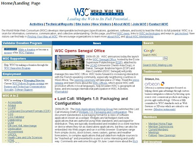
Real estate content area distribution: In this section illustrate the real estate area utilization scheme. Show how the page area is divided into different sections as header, footer, global navigation, secondary navigation, add areas ETC.

An illustration is shown below (It is an example)


Types of pages: This section encompasses different types of pages the application has. In general most of the web applications have these 4 types of pages
1. Home/Landing page
2. Main Section specific pages
3. Sub section specific pages
4. Task/Transaction related pages Branding guidelines: Each organization has its own branding guidelines that should be followed. These can be the company logos, the action buttons, the color combinations, the taglines etc. The branding will have the below important elements(Its up to the designer if he want to focus more on each element in the branding guidelines, well its a good practice to know each element with respect to branding essentails of the company)

1. Logo usage
2. Tag line
3. Imagery
4. Color
5. Language The company logo is always displayed on the top left corner in 30 X 40 pixels.
Tag Line example
a) Underneath the Evo text, when the Evo text is used alone.
b) Spaced alone, provided that the Evo house icon and/or text appear
on the same page.
Imagery example
Include the images that are approved by the stakeholders for different sections. It will have different banners, product images etc.
Error messages
Include the error message notification pattern. The color combinations used to inform the user the different types of errors. It also includes the place where the error message is displayed.

Error message example

Colors: In this section include all the colors that are used in the web site/ applications etc with their hex values.
Typography
Include the different types of fonts used for different sections of the web site. It includes the typography used for main section, the content, the header, buttons, footer section etc. It should provide even the colors of the mouse hovered texts.
Page Elements Description
Describe the elements that combine together to form a page. A page element can be the icons used, the tables used, the instructional messages, the approved images etc.
Icons used example Table design
Write the specifications about the table design. This will have illustrations on the color of table and the typography used in the tables.
Table example
Table color
The table line: # d7e7ef
Column header color: #464646
Table filled color: #ffffff
Table typography
Header text: Arial , 14 #ffffff
Hyperlink text: Arial, 12 #95c0d5
Inactive links: Arial, 12 #999999

Others: In this section you can illustrate how the page behaves when an overlay is displayed. The color of the overlay etc. You can include those sections that may not fit in the above main areas.
Once I want to highlight that the style of style guides may vary from designers to designers however their essance is covered above. Hope this helps to tweak some thoughts to come up with an effective style guide.
Read More
Posted in | No comments
Newer Posts Older Posts Home
Subscribe to: Posts (Atom)

Popular Posts

  • Adding Depth to the 8 Golden Rules of Interface Design (Shneiderman's rules for design)
    Ben Shneiderman, the founding director of the Human-Computer Interaction Laboratory, focuses on the studies of information and visualization...
  • Dissecting Discipline of Designing Experiences
    Often I come across different viewpoints on Experience Design discipline about what it is and what exactly experience designers do. The exec...
  • Championing the LUV of Design
    This has been contributed by Swarupa Manjunatha, an employee of MindTree. Netdiver Digital Culture Magazine. Yup! That’s it. A one stop shop...
  • Is ‘Responsive Design’ Enough? Don’t Forget the ‘Context’
    The number of consumers using smartphones and tablets to access websites, brands are increasing. This had led to reconsidering how to design...
  • What Game Designers Do That Interface Designer Don’t
    At many occasions stakeholders ask designers to design experiences that are simple yet immersive and engaging for commercial Web application...
  • Playful children and creative thinking
    Children are a great source of creativity when it comes to games and entertainment. Children are interesting to be learned and studied. Kids...
  • Uniform Resource Locators (URL’s)
    Most of us usually concentrate on the bigger picture that solves usability related issues. Sometimes, we also need to concentrate on the sma...
  • Sarit Arora talks about Emerging UX Trends & Practices at 'd+b Talks'
    Few days ago, Sarit Arora from Yahoo! visited our campus to give a talk on 'Emerging Interaction design trends and User Research for Inn...
  • Accessibility Testing: Underutilized Today
    Making sure that your website or application is accessible to all types of users (like the vision, hearing, cognitive, literacy, and the phy...
  • Can Gamification help achieve better adoption?
    You can lead a horse to water but you can’t make him drink. This proverb holds a lot of meaning in almost everything we do in our life, espe...

Categories

  • Accessibility
  • Accessible Software
  • aesthetic
  • airport
  • assitive technology
  • augmented reality
  • bangalore
  • brainstorming
  • cellphone
  • collaboration
  • Commenting
  • conference
  • content
  • content design
  • context driven design
  • crowdsourcing
  • Customer Experience
  • d+b Talks
  • dawakhana
  • delhi
  • design
  • design for mobile
  • design fridays
  • design mela
  • Design should be Fun
  • design thinking
  • digital experience
  • disable
  • drawing
  • e-reader
  • elements of signage
  • engaging experience
  • Experience Touch
  • Game Design
  • GIDS
  • Graphic Design
  • Graphics
  • guidelines
  • Haptics
  • HTML5
  • Icons
  • ideation
  • India
  • Indian Railways
  • Information Architecture
  • innovation
  • inspiration for design
  • interaction design
  • interaction pattern
  • Introduction
  • iOS
  • ipad
  • ipad 2 usages
  • iterative design
  • laptop
  • Latest Trends
  • leaptop
  • London
  • long term memory
  • LTM
  • megids
  • mela
  • microsoft
  • MindTree
  • mobile
  • mobile context
  • mobile experience
  • online experience
  • opnions
  • Osmosis
  • pattern
  • PC
  • Persona
  • personal computers
  • personas
  • photo storage
  • photos
  • physically challenged
  • Pictogram
  • Pret
  • problem
  • product design
  • QR Codes
  • Rapid Prototyping
  • Reference
  • Reservation Engines
  • Responsive design
  • Salary Survey
  • Search Engine
  • service design
  • session
  • short term memory
  • sign
  • signage
  • sizing the content
  • sketching
  • smartphone
  • Social Networks
  • solution
  • solutioning exercise
  • spastic society of karnataka
  • splash screen design
  • STM
  • street sign
  • tablet
  • tag
  • Tangible User Interface
  • TATE
  • Text input
  • thoughts
  • touchscreens
  • traffic sign
  • translation
  • travel
  • tree based navigation
  • TUI
  • ui patterns
  • url
  • usability
  • Usability Analysis
  • User Experience
  • User Experience Design
  • UX and agile
  • UX design and salsa
  • UX design principles
  • UX planning
  • Video
  • viewport
  • Visually Challenged
  • web experience
  • welcome screen
  • yahoo
  • YouTube

Blog Archive

  • ►  2013 (2)
    • ►  July (1)
    • ►  March (1)
  • ►  2012 (5)
    • ►  November (1)
    • ►  June (1)
    • ►  May (3)
  • ►  2011 (23)
    • ►  November (1)
    • ►  September (2)
    • ►  August (1)
    • ►  July (5)
    • ►  June (3)
    • ►  May (4)
    • ►  April (3)
    • ►  March (2)
    • ►  February (2)
  • ►  2010 (13)
    • ►  November (3)
    • ►  October (3)
    • ►  September (1)
    • ►  August (3)
    • ►  July (1)
    • ►  June (1)
    • ►  May (1)
  • ▼  2009 (13)
    • ►  October (1)
    • ►  August (1)
    • ▼  June (2)
      • Designer proposes, browser disposes
      • How to create a Style Guide with ease
    • ►  May (1)
    • ►  April (1)
    • ►  March (1)
    • ►  February (1)
    • ►  January (5)
  • ►  2008 (24)
    • ►  December (3)
    • ►  November (5)
    • ►  October (3)
    • ►  September (3)
    • ►  August (2)
    • ►  July (5)
    • ►  June (3)
  • ►  2007 (1)
    • ►  May (1)
  • ►  2003 (1)
    • ►  May (1)
  • ►  2002 (1)
    • ►  September (1)
Powered by Blogger.

About Me

Unknown
View my complete profile