- For example, if you know the name of a Prof. but not sure which Department he is in, you will keep looking within a Tree Structure.
- It works well for things which you know well. For example if you are looking for Specifications for Maruti 800 car tyre specifications. You know you will go via Car > Suzuki > Maruti > 800 > Tyre
- These may not work for deep-information structures with similar first-level categories. This is because the first wrong choice will lead you down a complete wrong path.
Wednesday, 14 October 2009
Tree based navigation
Thursday, 13 August 2009
Are travel agents making a comeback? - CNN.com
CNN published a news story around how travellers are going back to the Travel Agent. The reason cited as overly complex websites with complicated options and a need to 'speak to someone'.
Few thoughts come to mind:
One Size (doesn't) Fit All: Many travel websites are designed to cater to simple straight forward itineraries. Many wouldn't offer multi-city itineraires of split PNR etc. As a result for complex itineraries and special requirements you will go to a travel agent.
Understanding Business Drivers and Value a Function will Deliver
It's important to understand the business drivers of the Website (e.g. catering to two leg itinerary with two passengers) and design it accordingly. It's important to design the experience to 80% of use and still cater for exceptions. However, the remaining 20% may cost much more to deliver. So it's important to prioritise the resources than to please all.
Personas with Context
In User Experience methodology most practioners will design a Persona with specific likes/dislikes, demographics, preferred task etc. in order to provide a good User Experience. However, it's important to consider Context in Personas in this case.
The same consumer is a different persona at a different time
Most large coporates will still operate via a Travel Agent. However, what's interesting is that if I am working at MindTree's Bangalore office I send my request to our Travel Desk. But if I am working out of our London office, I do the bookings myself (lack of local know-how and low-volume may not require a Travel Agent in smaller offices). So the same individual in a different context will behave differently. Similarly, I book hotels and flights for most of my personal European travel myself. However, most of us will go via a Travel Agent when it comes to someplace less familiar.
Trend: Customer Purchase Focus
The focus/driver of a customer's buying behaviour cycles between: Performance > Reliability > Convenience > Price > Performance. When the purchase focus goes back to Price, the Product/Service needs reinvention to move the focus back to Performance. And this what possibly some website are doing (e.g. Kayak for performance and Trip Advisor for reliability). And individuals going back to Travel Agents are moving their focus from Price to Reliability as well.
Tuesday, 9 June 2009
Designer proposes, browser disposes
The browser wars continue. They never let us be at peace on the web. And now they have invaded the small screens too. So the nightmare continues. Every time you design something for the wild wild web, you have to check how it renders on the different browsers.
Some good news on this front. Test your web pages on different browsers and OS easily using Adobe BrowserLab . It generates screenshots of how the page would look on different browsers almost instantaneously. Currently, you can test for Firefox 2.0 (XP, OS X), Firefox 3.0 (XP, OS X), IE6 (XP), IE7 (XP), Safari 3.0 (OS X) only. Do check out the interesting "Onion Skin View", which superimposes one screenshot over another to see the differences between the different renderings. The bad news is that the service is free only for a limited time. It comes bundled with Dreamweaver CS4 though.
Another such tool for testing websites is to use an online service like BrowserShots, which generates screenshots for a web page in more than 80 versions of the most common browsers used in Windows, Linux, BSD and Mac. However, the process takes time, sometimes up to an hour, to see the screenshots.
Browsershots supports check with scores of browsers on multiple OS
More from ‘About Browsershots’ “....it is a free open-source online service created by Johann C. Rocholl. When you submit your web address, it will be added to the job queue. A number of distributed computers will open your website in their browser. Then they will make screenshots and upload them to the central server here.”
If you have to test only for IE 6, 7, 8 only check out Netrenderer.
Well that’s half the battle won. What if you haven’t hosted them yet? What about checking files locally?
Here are some quick solutions:
- Different versions of opera can be installed into the same machine if you install them into separate directories.
- Netscape (6 and 7) and Firefox (0.x and 1.x) used the same rendering engines respectively. Install any two and you are done. You can run multiple versions from the same machines by using profiles. Works for 2.x and 3 too. More info on profiles here.
- To run multiple versions of IE, go through the painstaking dual-booting or the slightly more convenient VM way.
- OS X requires emulators again. Never tried it though.
- Linux is a lot easier to run. Just run a version bootable from a CD/DVD. My favourite.
If nothing works get multiple machines. Or pay these guys for a paid service
About the small screen browsers. Coming soon.
Monday, 1 June 2009
How to create a Style Guide with ease
Style guides are important artifacts that are the byproducts of a well planned design work. They are made in order to provide a consistent User Experience throughout the application. In most of the cases they serve as a guide book for designers. It can be advocated that a single software/application can lead to a varying degree of User Experience by applying two different style guides for the same software. Here I will provide a view on how to create an effective style guide. Style guide creation is a good practice, we have heard this slogan many times. Now let us try to create one of these.
Style Guide Shouts about
In most cases a style guide turns to be a word file that illustrates the following aspects of a website/web application pages.
1. Real estate content area distribution
2. Types of pages
3. Branding guidelines
4. Error messages
5. Images used
6. Colors
7. Typography
8. Page Elements description
9. Other( Page Behaviors etc i.e. change of page color on overlays etc)
The style guide is used as a reference by design teams as a torch to provide a consistent user experience to its users. It guides them in knowing what typography to use, what are the sizes of icons, how the pagination should look etc.
Now let me illustrate each section in brief with simple examples which will provide a thought through to come up with style guides when you are designing the new applications.
Style Guide walk through – are you ready
Provide a small description about the style guide showing its relation to the software/web application. It will have a small description saying this style guide is of “XYZ web site” communicating its design elements, navigation, color combinations, branding etc. It will be used as a guide to design/modify the application etc. Now work on each section with a crisp brief as shown below.
Real estate content area distribution: In this section illustrate the real estate area utilization scheme. Show how the page area is divided into different sections as header, footer, global navigation, secondary navigation, add areas ETC.
An illustration is shown below (It is an example)

Types of pages: This section encompasses different types of pages the application has. In general most of the web applications have these 4 types of pages
1. Home/Landing page

2. Main Section specific pages

3. Sub section specific pages

4. Task/Transaction related pages
Branding guidelines: Each organization has its own branding guidelines that should be followed. These can be the company logos, the action buttons, the color combinations, the taglines etc. The branding will have the below important elements(Its up to the designer if he want to focus more on each element in the branding guidelines, well its a good practice to know each element with respect to branding essentails of the company) 1. Logo usage
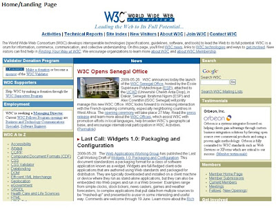
The company logo is always displayed on the top left corner in 30 X 40 pixels.a) Underneath the Evo text, when the Evo text is used alone.
on the same page.
Include the images that are approved by the stakeholders for different sections. It will have different banners, product images etc.
Include the error message notification pattern. The color combinations used to inform the user the different types of errors. It also includes the place where the error message is displayed.
Error message example

Colors: In this section include all the colors that are used in the web site/ applications etc with their hex values.

Typography
Include the different types of fonts used for different sections of the web site. It includes the typography used for main section, the content, the header, buttons, footer section etc. It should provide even the colors of the mouse hovered texts.
Describe the elements that combine together to form a page. A page element can be the icons used, the tables used, the instructional messages, the approved images etc.
Icons used example
Table designWrite the specifications about the table design. This will have illustrations on the color of table and the typography used in the tables.
Table example

Table color
The table line: # d7e7ef
Column header color: #464646
Table filled color: #ffffff
Header text: Arial , 14 #ffffff
Hyperlink text: Arial, 12 #95c0d5
Inactive links: Arial, 12 #999999
Others: In this section you can illustrate how the page behaves when an overlay is displayed. The color of the overlay etc. You can include those sections that may not fit in the above main areas.
Monday, 25 May 2009
Easy and efficient browse and search combination


All of us have seen many innovative ways of searching, filtering and browsing data from a list. While working on this dialogue I encountered this problem. I call it a problem because the list of users may vary anywhere in between 2 (for an entry level executive) to 50,000 for a CTO. And every level of users would use it frequently.
For an entry level executive, the browse model suits the best. Easy to use and prevents errors. However, for a senior executive, the search model would be the best.
PROBLEM
- These are 2 fields that need to be filled up in order to assign a user to a task.
- Each field can have any number of possible values ( I get to choose between 2-10 if I am a junior executive; 50,000 for a CTO!)
- All users are uniquely identified only by a combination of Area Code and ID.
- Data selected / entered in a field needs to be validated. Validation queries the database. Narrower the search , less is the system load.
- This selection has to be made on a Task Assignment dialogue that contains other fields as well.
CONSTRAINTS
- Development on Eclipse RCP using native SWT components only. Custom components can be developed only if “really required”.
- No AJAX (or any similar technology). To populate fields with data, we need to explicitly query the database.
- Keyboard navigation should not be affected
- This form/ dialogue is already a pop-up on the main screen
- Efficiency is crucial, so a Wizard interface is ruled out. (the development teams are not so happy with Wizard interfaces)
SOLUTION
- Users know how many users they supervise. So they make a choice between Browse and Search.
- Fields are dynamically displayed on the dialogue.
- On selecting ‘Browse’, the user gets a drop-down for Area Codes.
- On making a selection, the ID dropdown is populated. On selecting ‘Search’, users gets to input Area Code and query database.
- Data is validated and the IDs populated. Less than 30 IDs, dropdown shows.
- More than 30 IDs, need to type 2-3 numbers to allow data to be filtered.
Monday, 6 April 2009
Latest trends in online User Experience Team collaboration. Are you doing this?
How will one person convey the design message? How can we understand the initial wire frames etc.
http://www.twiddla.com/88239
Favorite 2: Bubbl us help in beautiful mind maps that you can share with team members. You can save, email, and print your mind maps and even embed in Web Pages
Favorite 3: Protonotes is a free annotation widget for your HTML prototypes. You can embed the simple java script in the HTML code. Once it is done your team members can open the web page and comment using notes on the screen. The notes can be easily moved & re sized to suit your requirement.
Favorite 4: Vyew is a web based conferencing tool. No need to buy a costly account. You can try this one for free. I think the maximum number of people that can join in is 20. It is somewhat similar to WebEx sessions but allows having a free account. Try this out.
Favorite 5: Wetpaint allows you to create a wiki site in collaboration. It can be effectively used as a tool to create content from different sources.
Favorite 6: Dabble board helps to create wire frames, flow charts, network diagram. It is an online whiteboard where you can improve your creative skills.
Favorite 7: Stixy is a flexible, online white board. It can be effectively used to create wire frames & mock ups. I suggest it to use it.
Favorite 8: Last but none the least. Google Docs is an excellent application for collaboration. You can share documents and spreadsheets and collaborate with your team/clients in real-time.
Hope you visit all the above tools & figure out which one suits your UX & collaboration needs.Happy collaborating. :-)
Monday, 30 March 2009
Consumer Psychology in a Recession
Consumers are affected emotionally. Marketing strategies should reflect the behavior and the intelligence of these consumers. In the video below, Harvard Business School professor John A. Quelch, talks about the consumer segments during the times of recession.
Video Source: Harvard Business Publishing
Sunday, 8 February 2009
Microsoft Tag - Mobile Tagging
"... Microsoft Tag. What is Mobile Tagging?: "Microsoft Tag creates unlimited possibilities for making interactive communications an instant, entertaining part of life. They tranform physical media (print advertising, billboards,product packages, information signs, in-store merchandising, or even video images)—into live links for accessing information and entertainment online..."
It's like a barcode meant for cellphone. You create one on the MS website by filling in a form and associating it with a URL. Cellphones can download a small application (from here) that reads these barcode using the cellphone's camera.
One can print these barcodes on poster, business-cards, letter heads whatever you like. The consumer/end-user may 'read' this barcode via the cellphone camera. The cellphone can then quickly connects to the internet (via the MS site) to get further information (the URL linked to the barcode)
I created one for this blog:

I remember a newspaper in the early days of Dot Com used to publish stories with barcodes and then used to send scanners to it's subscriber to help them read further on the internet :) - similar concept, but the technology has come further... camera have replaced barcode reader and 3G has replaced the dial-up line.
Thursday, 29 January 2009
User Experience: Less is more?
The concept of less is more stands true for content but not for images. While providing content and navigational patterns, users like to see less to understand more. But with the case of images, users need to feel it—which means that doing more with it is more effective and appealing it is to users’ eyes.
Have a look at what Alex does with his website: http://www.alextrochut.com/. With representative images and interaction, he proves that the more he showcases, the more his users would want to hang around.
On the other hand, with respect to providing content that is focused, the less you provide, the more you gain. An example of this could be seen at the homepage of Google: http://www.google.com/.
The Judgment
The contexts are completely different. If you want users to hang around and watch you, you give them more interaction elements along with an appealing visual design. On the other hand, if you want your users to handle a focused task at hand, you might want to consider the ‘less is more’ principle.
Friday, 16 January 2009
Uniform Resource Locators (URL’s)
- URL’s are not just clicked, but understood.
- Most users need simplicity to know their path ahead.
- Trust is built when details are closely monitored.
- Abbreviations are not recognized universally. But ironically, not all of us know what “URL” stands for.
Two types of URL’s come to mind:
- Shortcuts that you would like people to remember e.g. www.bbc.com/weather or art.ebay.co.uk
- URL’s that can be extrapolated e.g. if I know that all usability definitions are stored as http://en.wikipedia.org/wiki/Usability, I can find Interaction at http://en.wikipedia.org/wiki/Interaction
The first pointer is much simpler to achieve. It is a simple configuration on the server which tells the server where to go when someone asks for, let’s say, www.url.com/abc. The latter is tricky. The factors that hinder this are:
- Nobody captured it as a requirement.
- A technical limitation e.g. the Content Management Server does not allow such a URL e.g. http://www.postoffice.co.uk/portal/po/jump1?catId=19300207&mediaId=26800661
- It’s an application that does not follow logical structures e.g. you should not/ can’t reach the page 3 of a checkout process.
- The structure of the application mimics the directories in which different solutions are compiled. And hence, you see things like MCMSWebApp or http://viv.ebay.co.uk/ws/eBayISAPI.dll?EbayTime in the URL – something that can be completely avoided on day 1, but is an expensive change later.
- Information can be accessible from multiple paths and can sit in multiple categories. Despite all the flak that Microsoft gets, it’s one of the companies whose products (like Content Management Server or SharePoint) emphasize on it. As an example (not the best ones), if you look at Jet Airways www.jetairways.com, all pages reflect the directory structure e.g. http://www.jetairways.com/Cultures/en-US/United+Kingdom/Products+and+Services/In+flight+Services
- Another example includes http://news.bbc.co.uk/1/hi/world/south_asia/default.stm
The Bigger Gain
We might not realize the relevance of simplifying URL’s as it just requires clicking. But most users step into it or click on it only once they know what lies ahead. If users don’t understand URL’s, they are not going to tread into it deeper. This means that we have lost a prospect or even an existing customer. This just goes to say that the 80/20 rule holds true in this case: http://en.wikipedia.org/wiki/Pareto_principle.
Here is an article on this topic: http://uxmatters.com/MT/archives/000240.php