Experience Design

  • Subscribe to our RSS feed.
  • Twitter
  • StumbleUpon
  • Reddit
  • Facebook
  • Digg
Showing posts with label Tangible User Interface. Show all posts

Friday, 9 September 2011

User Experience: Petrol Pump

Posted on 03:48 by Unknown
Objective: How to enhance the user experience at a Petrol Pump?

The Story:

I recently came across this problem statement, that was given to the manager of a Petrol Pump. I imagined myself to be that manager, and thought, thought hard! Then I browsed the internet to have a look at the variety of petrol pumps that we usually come across.


I also thought about some of the characteristics of a petrol pump :
  • Petrol is more of a commodity, with prices differing only between states. Some companies tried to create Premium products but I have seen commoditization even on those premium products. So, a person is largely indifferent on where the petrol is getting filled from! 
    • There might be exceptions: Example: People believe petrol available on highways might be impure and ruin their engines. 
  • Personnel at a petrol pump understand numbers, so one needs to indicate what and how much is required. And since, petrol or diesel doesn't usually have local names, language barriers are low. 
  • Services usually offered at a petrol pump: Petrol filling (obviously!), Air Check and Pollution check
  • Petrol pumps are businesses of scale just like hyper markets. 
  • Service design - 
    • How many vehicles can fit in at a time?
    • Maximum capacity
    • How will vehicles get in?
    • How will vehicles get out?
Now, my thoughts went on to how can one enhance the user experience given such characteristics of a service. And an important point to note is that, "Enhancement of User experience is not an end goal, it is a continuous process. One can add some components in a service that may seem to achieve the goal, but it will be momentary."

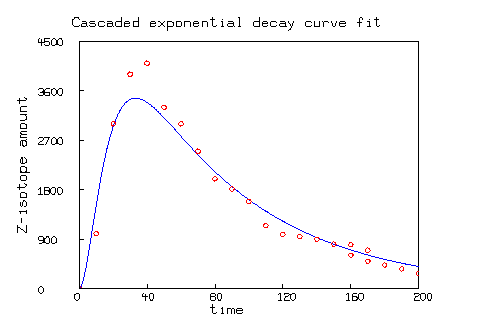
Without any proof, I dare to show how a user experience curve might look like, something like this decay curve over time!
Hence, my point here is not to build the perfect service, rather build relationships over time; relationships between employees and customers, that give the necessary feedback into the system to enhance further. Here we go with my observations on how some petrol pumps do that:
  • As soon as we enter some petrol pumps a person guides us to the shortest line, or stops us or the line to get shorter. He also indicates the approximate time required to wait. In India, usually it is 2 minutes!
  • We also observe arrows to indicate the manner in which our vehicles should enter the filling areas and out of it.
  • A friendly smile when we stop the car is always welcome!
  • While, our vehicles are getting their food, someone comes over to ask "Sir ji! Shall I clean your windshield?" So, by the time the refilling id done, your windshield gets a makeover!
  • If you are paying by card, there is an apprehension as the cashier takes the card along inside a queer building. To change all that some petrol pumps are now equipped with mobile card swipes for Visa to American Express! (American Express, although an express, is the least accepted card in India, according to my observations! That's why it needed special mention :) )
  • I would love if someone would be able to check the tire pressure as well while I am filling. This trend is yet to catch up due to some unknown reasons. But this would be really useful!
  • Extra lubricants, and oils within a hands reach is always better at the petrol filling station. Not many petrol pumps do that, hence causing that unnecessary delay in delivery the service
  • Petrol pumps are also the best places for driving directions (till the days when we will each get a GPS!) So, an intelligent, direction-informed attendant is a good resource at any petrol pump.
  • I think the idea of a supermart at a petrol pump has still not picked up in India. But, I have surely seen the potential for a small vendor selling ready snacks like chips, tetra pack of juices, cans of cold drinks etc.
  • And finally, if the person filling up my car gives that "I know you!" smile and the greeting then it makes us feel special! We feel like sharing our car troubles with him. We also give the person tips at times! And, as we embark on our journey for user experience, this is the just beginning.... ...
Read More
Posted in India, interaction design, service design, Tangible User Interface, User Experience, User Experience Design, UX planning | No comments

Friday, 3 June 2011

Content is King

Posted on 20:46 by Unknown

"People don’t read, especially when it comes to web and mobile" - I said that!
 
 
Content is important:
  • Content adds value
  • Content is part of user experience
And it is becoming increasingly important with the 'Mobile First' design philosophy coming into power. But, much of the mobile first design philosophy fails due to one big reason: CONTENT

And CONTENT failure is not a new phenomenon; it is to be seen even in web specific designs. If, we go to the root of the problem, then it is the different user behavior on web and mobile.

Keeping this in mind here are some guidelines to create content. These are applicable not just for Mobile but for web as well: 

1. If first 160 characters do not sound meaningful, rest of content cannot be useful!
With reducing attention spans, one needs to impress the audience with the first 160 characters. If an idea can’t be put in short, there will be no one listening to it. And if there is no one listening then an idea is useless. So, it makes more sense to put in all the skills to make that 160 character impressive!

2. If everything is useful, then everything is useless
Yes! There has been no mistake in the above statement. If one thinks that everything is useful for a site’s target audience, then surely there has been a mistake. Usually, we tend to fill in so much content, that everything seems to be useless and a person tends to drift away.

3. Use scan-able keywords
Every user opens a site with something in mind. If that is not scanable or searchable then it is highly unlikely that the user will stay for more.

4. Start with conclusions and recommendations
Inverted pyramid style of writing is the key for every content on web and mobile. People want to know quickly about everything; no one has time to read on and on….

5. Attention grabbing headings, meaningful subheadings
Headings are to get attention and subheadings are to make use of that attention span. Keeping a subheading simple, without jargons and to the point helps to gain trust as well. Jargons, complex terms, clever lines are meant to be for the Main heading, keep them out of the rest!

6. A picture is worth 1000 words, but we don’t want 1000 words!! Do we??
The intention is to keep it simple, neat and easy to download. A picture may seem to be the best option to give a visual appeal and represent an idea, but it increases the size. And with download speeds varying unpredictably, sometimes, pictures are a blot to user experience.
Read More
Posted in content, content design, digital experience, mobile experience, Tangible User Interface, User Experience Design, web experience | No comments

Tuesday, 9 November 2010

Rapid prototyping for tangible user interface designs

Posted on 08:55 by Unknown
As designers we apply participatory approaches of engaging users and stakeholder in the design process for better design outcomes. Using white board, affinitive mapping, brainstorming, wire-framing, prototyping etc. in order to arrive at functional specifications are common practices required in product development. These activities not only serve the purpose of design but also to communicate ideas and concepts to various stakeholders.


The idea is to understand if conventional design techniques would stand complexities around designing Tangible User Interfaces (TUI). Let’s explore in detail. TUI is a user interface, where a user interacts with digital information through physical representation.  Designing for TUI brings various challenges to designers primarily due to physical representation of digital information and variety of complex interactions available. Watch this video for a better understanding. 


For designing a TUI system, a designer needs to consider physical objects, physical actions, interactions and physical environment because everything is an interface that interacts. More than just complexities around TUI itself, there are challenges with respect to effective communication of design concepts to stakeholders for their buy in. This leads to a few questions to our use of conventional design approach. How effective our conventional design approached would be for TUI designs?  Should we adapt to rapid prototyping technique? Would rapid prototyping help designers conceptualize and communicate ideas better.


Consider a brainstorming session; we bring a mix of designers, developers, implementers, managers, stakeholders and users. Brainstorming brings ideas to the table in order to solve a design problem.  During such sessions, the effectiveness of communication is maintained by making use of whiteboards, post-its, paper and pen. Mostly the systems we design are for two-dimensional space. But when it comes to design for three-dimensional spaces, we should be using three-dimensional objects. We know it is important for people to express their views and have effective communication to develop innovative ideas. Rapid prototyping with three-dimensional object would be major drive to bring people into action.


In designing for TUI, it seems important for designers to use three-dimensional objects for prototyping. By introducing such dimensions communication and engagement of groups can be increased. This could help designers to visualize the space that they are designing for. And in addition, designers can investigate on affordance and metaphors used of the group to formulate the thought process. This approach can produce positive outputs during discovering phase of a product development lifecycle and to frame them during definition phase.

Special Thanks to
Vinay for editorial hands
Tangible Bits for sharing the video
Read More
Posted in Rapid Prototyping, Tangible User Interface, TUI | No comments
Older Posts Home
Subscribe to: Posts (Atom)

Popular Posts

  • Is ‘Responsive Design’ Enough? Don’t Forget the ‘Context’
    The number of consumers using smartphones and tablets to access websites, brands are increasing. This had led to reconsidering how to design...
  • “Tizen” Knocking the door… Do we really need another Mobile Operating System?
    R eports have confirmed that “ Samsung ”will be using “ Tizen OS ” for its new upcoming high-end smart phones. Well the smartphone domain is...
  • Mobile Barcodes, The Next Generation mode of marketing
    Is there a segment of the communications market more exciting and more rapidly evolving than the mobile space? Hardly. While it wasn’t the f...
  • The not-so-smart market shares of smart phones
    We shouldn't be surprised if the latest IDC figures make Andy Rubin do it the Gangnam style. Android notched up 75% of the smartphone m...
  • Can Gamification help achieve better adoption?
    You can lead a horse to water but you can’t make him drink. This proverb holds a lot of meaning in almost everything we do in our life, espe...
  • Sarit Arora talks about Emerging UX Trends & Practices at 'd+b Talks'
    Few days ago, Sarit Arora from Yahoo! visited our campus to give a talk on 'Emerging Interaction design trends and User Research for Inn...
  • This week at d+b talks
    This week at d+b talks, Sarit Arora from Yahoo talks on 'Emerging Interaction Design Practices' and 'User Research for Innovatio...
  • Championing the LUV of Design
    This has been contributed by Swarupa Manjunatha, an employee of MindTree. Netdiver Digital Culture Magazine. Yup! That’s it. A one stop shop...
  • Accessibility Testing: Underutilized Today
    Making sure that your website or application is accessible to all types of users (like the vision, hearing, cognitive, literacy, and the phy...
  • What Game Designers Do That Interface Designer Don’t
    At many occasions stakeholders ask designers to design experiences that are simple yet immersive and engaging for commercial Web application...

Categories

  • Accessibility
  • Accessible Software
  • aesthetic
  • airport
  • assitive technology
  • augmented reality
  • bangalore
  • brainstorming
  • cellphone
  • collaboration
  • Commenting
  • conference
  • content
  • content design
  • context driven design
  • crowdsourcing
  • Customer Experience
  • d+b Talks
  • dawakhana
  • delhi
  • design
  • design for mobile
  • design fridays
  • design mela
  • Design should be Fun
  • design thinking
  • digital experience
  • disable
  • drawing
  • e-reader
  • elements of signage
  • engaging experience
  • Experience Touch
  • Game Design
  • GIDS
  • Graphic Design
  • Graphics
  • guidelines
  • Haptics
  • HTML5
  • Icons
  • ideation
  • India
  • Indian Railways
  • Information Architecture
  • innovation
  • inspiration for design
  • interaction design
  • interaction pattern
  • Introduction
  • iOS
  • ipad
  • ipad 2 usages
  • iterative design
  • laptop
  • Latest Trends
  • leaptop
  • London
  • long term memory
  • LTM
  • megids
  • mela
  • microsoft
  • MindTree
  • mobile
  • mobile context
  • mobile experience
  • online experience
  • opnions
  • Osmosis
  • pattern
  • PC
  • Persona
  • personal computers
  • personas
  • photo storage
  • photos
  • physically challenged
  • Pictogram
  • Pret
  • problem
  • product design
  • QR Codes
  • Rapid Prototyping
  • Reference
  • Reservation Engines
  • Responsive design
  • Salary Survey
  • Search Engine
  • service design
  • session
  • short term memory
  • sign
  • signage
  • sizing the content
  • sketching
  • smartphone
  • Social Networks
  • solution
  • solutioning exercise
  • spastic society of karnataka
  • splash screen design
  • STM
  • street sign
  • tablet
  • tag
  • Tangible User Interface
  • TATE
  • Text input
  • thoughts
  • touchscreens
  • traffic sign
  • translation
  • travel
  • tree based navigation
  • TUI
  • ui patterns
  • url
  • usability
  • Usability Analysis
  • User Experience
  • User Experience Design
  • UX and agile
  • UX design and salsa
  • UX design principles
  • UX planning
  • Video
  • viewport
  • Visually Challenged
  • web experience
  • welcome screen
  • yahoo
  • YouTube

Blog Archive

  • ▼  2013 (2)
    • ▼  July (1)
      • Is ‘Responsive Design’ Enough? Don’t Forget the ‘C...
    • ►  March (1)
  • ►  2012 (5)
    • ►  November (1)
    • ►  June (1)
    • ►  May (3)
  • ►  2011 (23)
    • ►  November (1)
    • ►  September (2)
    • ►  August (1)
    • ►  July (5)
    • ►  June (3)
    • ►  May (4)
    • ►  April (3)
    • ►  March (2)
    • ►  February (2)
  • ►  2010 (13)
    • ►  November (3)
    • ►  October (3)
    • ►  September (1)
    • ►  August (3)
    • ►  July (1)
    • ►  June (1)
    • ►  May (1)
  • ►  2009 (13)
    • ►  October (1)
    • ►  August (1)
    • ►  June (2)
    • ►  May (1)
    • ►  April (1)
    • ►  March (1)
    • ►  February (1)
    • ►  January (5)
  • ►  2008 (24)
    • ►  December (3)
    • ►  November (5)
    • ►  October (3)
    • ►  September (3)
    • ►  August (2)
    • ►  July (5)
    • ►  June (3)
  • ►  2007 (1)
    • ►  May (1)
  • ►  2003 (1)
    • ►  May (1)
  • ►  2002 (1)
    • ►  September (1)
Powered by Blogger.

About Me

Unknown
View my complete profile