Experience Design

  • Subscribe to our RSS feed.
  • Twitter
  • StumbleUpon
  • Reddit
  • Facebook
  • Digg

Friday, 29 April 2011

Why should one go for iPad : iFAD?

Posted on 21:53 by Unknown
In one of our team meetings recently, the topic jumped up again, "Why should one go for iPAD? Is it a Fad?"

There were mixed views for iPad. Some were of the view that iPad is a great product with advantages of being light and easy to carry. One can carry it along for presentations or on travel to read. Many others were of the view that a laptop can do much more than just presentations and reading. Finally, a general consensus was formed that probably "an iPad is a rich man's second laptop"!

Not long ago, we had termed laptops as "rich man's second computer", I didn't even realize when we moved ahead of that era, now I rarely see those big Personal Computers being purchased with as much vigor. Everyone seems to get Laptop or even better a Netbook. So, the confusion gets even worse.

Some more points to be pondered on.
  • The smartphones are becoming smarter. I think by the end of 2011 we will have smart phones with 3D projection capabilities, connectivity to all sort of networks and of course a processing power that can bring a laptop of today to shame!
  • Do we recall a device called "Pager"? It was a sort of "Twitter" on the go! Wasn't it revolutionary? Where did it go?
  • How many devices can a person carry without getting pissed off? One of my teachers once told me that a person can't manage more than 2 activities at a time: home and office, office and personal relationship, personal relationship and studies, studies and office. I think that time has been a proof for that statement, and I firmly believe in it. Extending the same theory, I am of the opinion that a person can't manage more than 2 devices successfully. Most of us must be having a laptop and a phone. If I bring in a iPad along, then one of the 2 former devices have to go! Either a laptop or the phone. 
  • It is unlikely that we will go away with a phone. What else can we put in our pockets, hold in our hands and talk for hours on? Surely not an ipad! Until and unless we have custom designed clothes to hold them :)

There is no conclusion to this post. Rather, I am still confused on where we are heading to. Conclusively, I can only say that out of Laptops, Netbooks, Leaptops, iPads, phones, smart phones, smarter phones, Kindles, Adams and ... we will have to choose only 2 devices at a time. Most of the devices will converge into others and new devices will evolve over time. More fads will come, some will stay some will  not even be mentioned in history.....
Read More
Posted in ipad, laptop, leaptop, PC, personal computers, tablet | No comments

Sunday, 24 April 2011

GIDS conference: My Experience

Posted on 22:59 by Unknown
Great Indian Developer Summit (GIDS) was held on April 19 -22, 2011 at the green campus of IISc Bangalore. I attended the second day of conference, that was focused on Web trends and technologies. The sessions by Venkat and Harish were really good. The details of these and other sessions follow.

The conference began with “Building the next generation of experiences” by Arijit Chatterjee. Arijit is Engineering Manager for Platform Evangelism at Adobe Systems India. The trend of preferences for people is changing. Everyone wants to have better experiences, be it food, clothes or digital experiences. The experience has moved on from desktops, to laptops, to tablets and currently to smart phones. People want to have a meaningful, easy and engaging experience. There are essentially three areas of innovation in this:
1. Content authoring for the creators,
2. Customer experience management for businesses and
3. Online analytics and optimization to ensure the best value being delivered.

This session was followed by "Designing User Experiences for multi screen applications with Flash, HTML5 &CSS3" by Harish Sivaramakrishnan. Harish is a Platform Evangelist at Adobe Systems. He is also a UX design and usability expert. His talk highlighted the various devices available for communication, work etc today. The talk explored the possibility of designing the same user experience across all the different form factors i.e tablet, ipad, smart phones, desktop etc. Some practical ideas to be used by the developers to efficiently complete the coding , and the code that can be reused across all the different form factors, different screen resolutions using Adobe Flex, Flash, HTML 5 and CSS3. The programming tips and tricks were shared in these 3 platforms.


"HTML5 more than HTML5" was an interesting and thought provoking talk by Harish Vaidyanathan, who leads the evangelism efforts for Microsoft India. This session explored HTML5 and the session gave summary of HTML5 features. The session started with quick note of the logo design of HTML, and moved on to the features. Features include button curves, shadows, gradient can be done directly by coding. The button can have 4 different curve radii for 4 corners, button/ object can have shadow by placing lights .The best part is that while coding the screens can be checked by viewing in all the resolutions of different form factors. HTML5 combines the designer and developer skills and hence bridges the gap. Harish also gave aother session on "Unleashing a more beautiful web", some of the content was repetition of HTML and few features of IE 9.

"Towards a humane interface, aesthetic and usability" by Venkat Subramaniam. Venkat is the founder of Agile Developer,Inc. He has significant experience in design, architecture and development of software applications. The session gave an insight about usability in everyday interactions. Usability is more than just a “WOW” factor, it is more about making an application easier and intuitive to use. A successful application has to focus on three dimensions: business, design and usability. He gave few hilarious examples of User experience gone wrong in various products that he has come across. A spicejet check-in kiosk, Honda car to a programming language. The examples drawing to a very crucial point about Keep it Simple Stupid (KISS) rule. This was a fantastic simple session and will be sharing the presentation to MT UX community once i get my hands on it.

The conference gave insights on the changing technology and its usage. A better world of tomorrow for designers and developers .

Thanks Ankush for reviewing the draft.
Read More
Posted in aesthetic, conference, design, GIDS, HTML5, megids, usability, User Experience Design | No comments

Wednesday, 20 April 2011

What Game Designers Do That Interface Designer Don’t

Posted on 07:29 by Unknown
At many occasions stakeholders ask designers to design experiences that are simple yet immersive and engaging for commercial Web applications. They leave it completely to the designers to think of ideas to achieve such designs. But, commercial Web application designers are always busy designing applications that are a function of


(Over simplification of Web application design)

They make sure all the business rules are incorporated, the right system response is in place, the right set and amount of information is presented so the right decisions are taken and so on and so forth. I would also go ahead saying that there is nothing grossly wrong with that approach. And while the results are not always great designs, they are not bad either.

But there are traits of game designs that an enterprise application designer can experiment with and design experiences that are memorable and desirable for people who use them. Theoretically, game design is not all that different and designers from other fields are perfectly capable of doing much of what game designers do.


[A gross oversimplification of game design (Stephen Anderson’s way)]

Instant Gratification vs. Slow Response Time
In most commercial software interfaces response time management is completely overlooked. The rule is “faster is always better,” and Google has almost mastered it. Search results displayed are shown with how many milliseconds it took for Google to process the results. However, game designers don’t think likewise and they defy the concept of instant gratification by making a good use of response time. It is like one driving to a hill station on a vacation with friends and family where en-route experiences are equally important as reaching the destination is. Slow response time also allows users to think of their next move.

Closure to Completion Effect
Gamers become more aggressive, thrilled, and impatient when they come very close to completion of a level, task, or an activity in a game. But game designers design these activities to be highly unpredictable and vulnerable, to take the gamers' excitement to the peak (for example, a game of Jigsaw Puzzle or Sudoku at the verge of completion). Similarly, Web application designers can start thinking of ideas to make the last piece of a task or an activity more engaging and exciting.

Learn To Become More Efficient In Future
Gamers become more efficient as they play and eventually become experts at it. Game designers leave cues that gamers use as tricks and keys to reach the expert level. The vast majority of software user interfaces have no consideration for how users can be taught by experience with the system to improve their performance. It is about finding those hidden patterns in the way people interact and manipulate the system. It is an applied learning that a user gains and reuses in different conditions to get faster results.

Short-term Memory Management
People love gaming because it challenges their reflexes, thinking, intuition, and dedication as they make progress on higher levels with increased amount of complexity. Short-term memory management is a great tool for game designers to increase or reduced the complexity of the game. Interface designers are trained not to rely on user’s short-term memory (for example, showing a piece of information and expecting the user to remember it to reenter the same somewhere else in the system).

However, game designers use it quite often in forms of locations, maps, symbols, and passwords which the gamers need to remember to clear a level or to reach a place. For example, arcade games use word codes that are displayed when the level is completed. These codes are supposed to be remembered by the player to reenter to reach that level directly from beginning else he or she will have to pass through all the previous levels to get there. Similarly, the famous AngryBird game shows the cage structure once to the player and leaves it to the player’s imagination to strike in the right area.

Building Mystery
Game designers carefully design interactions that in a way expand the player's mind and force him or her to think what’s happening. It is the mild confusion created with just enough context to consume the player’s cognition in subtle and compelling ways.

Enterprise Web application designers think of making interaction highly intuitive and transparent at all times. They think of giving surprises by making the application learn users patterns and start intelligently predicting their next move and automate it.
Read More
Posted in engaging experience, Game Design, short term memory, User Experience Design, UX design principles | No comments

Sunday, 27 March 2011

MindTree UX Unveils the Mask @Osmosis ‘11

Posted on 05:51 by Unknown

At MindTree, it was again the season of Osmosis, the company’s annual event which is a platform to showcase and share knowledge of different verticals and groups with the rest of the MindTree Minds. For the MindTree UX team it was again a time to decide how to participate. We decided we’ll do something engaging and from then on there was no looking back. Two weeks in advance, our event planning began by creating a task force. We went crowdsourcing, looking for ideas, subjects, and disciplines which can be showcased as part of the overall theme of the UX stall. Our hunt for ideas generated umpteen ideas such as:

  • Beyond the ‘Social’ Network: how social network is being used for non-social purposes (both good and bad)

  • Immersive experiences: How the video games and 3-D technology will merge to create more immersive online experiences

  • Green design

  • The four dimensions of Information Design: beyond the organisation, that is, space and time

  • Information is a continuum (and not discreet interactions on individual devices)

  • Simplexity: how future systems will be designed ‘simple to interact’ feel with complex backend logic and processing behind the scene

  • Information overload

  • Connecting ideas and not pages (making sense of unstructured data)

Every idea sounded interesting. Unanimously the team decided to pursue a theme that impacts thinking of people in the system, that is, knowledge of user experience and its impact on people and business. In other words, an attempt was made to educate people that user experience design is not about making pretty screens. Design of a pleasing, usable interaction requires effort from various disciplines such as graphic design, information design, interaction design, human factors, psychology, usability, ergonomics, and knowledge of business and technology trends. We wanted to convey the message: “UX is not just about pretty face.”


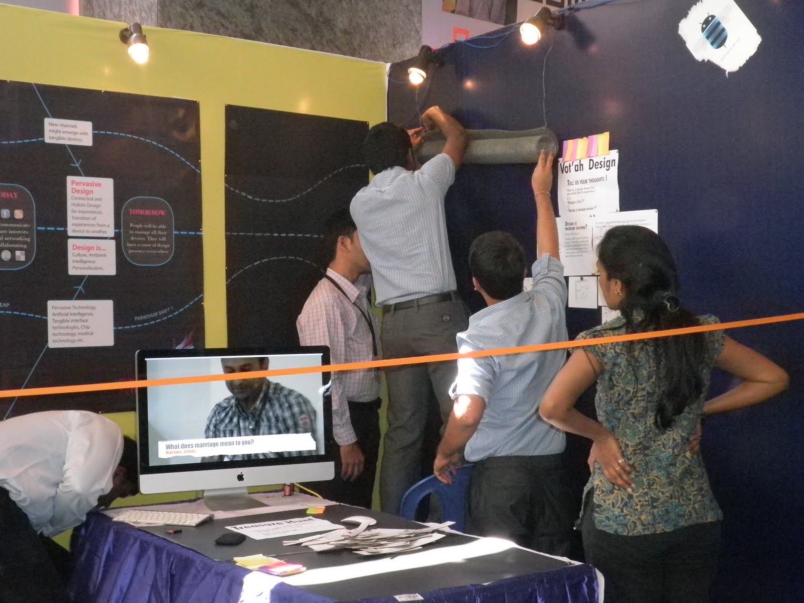
UX Osmosis stall was inaugurated by our youngest UX designer Ramshi Hamza. We designed the stall to attract and encourage all to participate in Osmosis. We all joined together to have fun.


The concept of ‘Time Travel: Design, Business & Technology’ was the lead communication (10ft by 5ft flex poster) designed by Vallabh, Baizil, and Ankush. The poster showed design, business and technology advancements over the last 15 years, with the intention to describe how the ‘push and pull’ between technology, business and design has forced each other to reinvent. It also showed how many other disciplines such as human factors, psychology, usability, ergonomics, and anthropology became part of the mainstream design practices. We asked participants to come and share their views on what they think the future of business, technology and design would be. We got some interesting responses that we will be publishing in the later issues.


Some of these videos showed the futuristic designs especially about ubiquitous computing and some user interviews that we carried out to understand the behavior with respect to social media spaces. We discussed immersive experiences through examples of work done by other design practitioners. But the actual learning of immersive experiences came only by experiencing Microsoft Kinet (Thanks to Danny for making the arrangements!). Many MindTree Minds joined us playing and enjoying the game irrespective of their position, age, etc. Watch the videos to watch them play!


We wanted to engage people in a design lead activity where they could feel a sense of participation and achievement. We made 20 paper boats with cartridge sheets and provided paints and brushes to people and asked them to unleash their creativity and talent. We allowed them to be creative in their own ways. Very quickly we realized that we have 20 people painting at a time and almost the same number waiting for their turn. We had to arrange for more paints, brushes, and boats. At last we ended up with 140 boats painted by MindTree Minds that are now available as a collage fixture at fourth floor in the Phase 1 building of MindTree West Campus. On an average each participant spent 10-15 minutes painting a boat; such an immersive participation would be difficult to achieve in an art competition. Thanks to Diba, Shobha, Ramshi, and Vinay A. for making it happen.


Vot'ah design: Participants were asked to vote for the purpose of design. They were asked whether "Design is problem-solving" or "Design is fun". Two examples used for illustration were:


  1. Design is fun: A glider that is designed to capture unusual video shots from different angles in the air. Users will launch the glider in an open space; a small camera mounted on the nose of glider will record video of people on the ground.

  2. Design is problem solving: An electric socket that is designed to accept any pin size and voltage and has an extension cord, if required, with capabilities to carry mobile phone on top.

Participants were asked to choose a theme and also leave a comment in support of their choice. In three hours, there were 80 people who had voted and of which 65% chose design more problem-solving than fun. The other activity was to hunt for web parts (treasure) or broken web page components to build as one. People were given two choices of designs before they started playing the game. Thanks to Natraj and Shobha for designing and executing such learnable experiences. The Osmosis UX stall was a wonderful example of superb coordination, self-motivated team-work, and a sense of expression and play. I sincerely thank Ankush, Baizil, Chinmoy, Danny, Diba, Hetna, Mukesh, Natraj, Ramshi, Vallabh, Veena, Vinay A, Vineet, Satya, Shobha, and all the participants for their contribution and support.

Read More
Posted in Osmosis, User Experience Design | No comments

Saturday, 26 March 2011

MindTree UX Osmosis '11 Photos

Posted on 11:54 by Unknown


Read More
Posted in Osmosis, photos | No comments

Tuesday, 15 February 2011

adiVERSE virtual footwear wall

Posted on 20:07 by Unknown
The future of retail lies in bringing together the worlds of digital and retail to offer extraordinary in-store customer experiences. Unveiled at the 2011 National Retail Federation Expo in New York, this interactive, real-time rendered product installation for adidas demonstrates UK brand agency Start JudgeGill’s belief in “connected retail.” The experience brings shoppers the products they want, even if they’re not currently available in a store, and gives adidas the opportunity to offer its largest range of products in even its smallest stores. Behind the scenes, the system is currently gender and age-aware and presents relevant products faster; adidas will eventually enhance the shopping experience by placing products in the context of the sport for which they’re designed. Once the success of the adiVERSE system for footwear is tested and demonstrated, there are plans to expand to apparel and accessories, in stores worldwide.


While this is a cool in store experience design concept. I am still wondering that this concept is very similar to web experience of http://www.nikeid.nike.com/.

In store experiences are all about touch and feel and in store social interactions. Customers walk in to Adidas store with bunch of friends and they spend time comparing assortment based on style, color, pattern, texture, price etc. Customers often see stuff online and make purchases in a nearby store. It is good that customers will be able to see all products even when they aren’t available. But can be a bad experience if they like something and not able buy instantly (specially for impulsive buyers)

I believe such digital displays can be a good idea for mobile stores where stores have dummy phones on display.

This installation works well when customer service reps are busy and there’s no one to explain the details. However, most customers typically wear the shoes, walk around a bit to check if it the right one. Maybe, they can use a combination of haptics and Kinect’s technology to give a real feel of the shoe.

Why a person need another interface such as iPad to check out the shoe?

Well, there can be various reasons to do so. One of them can be: In major metros the rental spaces are going sky high, the display is limited and in western countries even the labour is expensive. In such cases, you cannot have all the shoe models out on display in a mall commercial store. So, it is better to give alternative mediums to customers for checking out the collection. One such medium is Ipad, Iphone, or big touch screens as shown in the video.

But then why don’t we integrate later part (iPad) with the initial one (wall)? Suddenly, there is change of experience and person has to wait on the shop keepers to receive the iPad.

Possibly becuase when the person on the video said “now you can checkout” I was thinking OMG checkout on that screen …where world can see all the personal information !!!.

So having the checkout done on a smaller personal display is a clever way to maintain individual’s privacy. I am curious however to understand how they can transition the session from wall to a device like iPad, that is probably beginning of new era in transitioning from one device to another without breaking the flow.

Imagine you are working in office and you are half way through filling your appraisal online…., then you walk to train station and complete the remaining form filling on the phone (same session)…. Later submit it from home computer in the (same session). It is a good a way, to keep the our transactions secured.

Then the other question would be, why the checkout is not happening at the checkout counter?

Well, if we have same session then will it not affect the security, I would imagine that someone could get to the sensitive information. Well, that’s a valid point, But, for us to understand it, let’s go through a small exercise.

Suppose you walk into a shoe store. There is a security guard at the entrance. You go to the display counter and look through the range of shoes on display. When you like a couple of them, you ask the salesman to get the sizes for those particular shoes. You will even like to try out those shoes. Then you zero down on one of the choices, and move towards the payment counter. There the cashier bills you accordingly and you walk out of the store. The security may again check your bills and match it with the purchased items.

Now, we see that there are at least 3 people involved in the whole transaction for one customer. Many stores go away with the security guard. The store that we saw in the video has gone a step ahead and removed the cashier and salesman as well. In effect we have highly reduced the manual intervention, which is highly desirable in high labour cost economies or businesses where ratio of labour cost to purchase cost is high.

I agree upon the point that it would reduce the manual interventions. Here store keeper approaches the customer with an iPad. It do not seem to be a practical to me, to keep a person ready to take iPad to customer.

As discussed before, the experience at the store is to have social interaction through touch and feel.

Being to show rooms of cell phones, I look up those cell phones and I hardly read any information that is printed next to the phone. Instead, I ask the sales representative about the product. And make him compare on the different products that I am interested in. And, I know I might be able to get the relevant information from any other web source. At store, I am getting the experience of interacting with other person, who can somewhat able to relate to me.

I think a retail store is about the personal connection, real experience (look, touch and feel) and also to help buyer make their right decision. For instance – Some time back one of my friends wanted to buy a sports watch (Having features of Altimeter, Barometer, Thermometer, Tide Graph, Heart Beat etc.). He was getting a discount price online but not in the store. So he short-listed some models browsing the online product list, specifications and prices. He also read the reviews of those watches but was not able to finalize the model that he should go for. He was skeptical as the watch was pretty costly and the virtual image differed from the real one (look, touch and feel). Finally he visited the store (Bangalore Central Mall), had a real experience (by trying out, comfort, product aesthetics when he is wearing it, etc.), and talked to the sales representative and zeroed down the final one. After that he confidently placed an order online.

Focus here (Adidas) is to guide and motivate people to purchase by leveraging information of 8,000 pair of shoes (without having to be a flagship store), technical specifications, related videos and user feedback. But the real product display and sales man shouldn’t be replaced with the touch screen. (The salesman helps buyer to try out different shoes, Buyer decides the final one based on the comfort and similar other parameters) Therefore I think creating a virtual experience in a physical store will only help in getting information about the products in a smart way but cannot succeed in the real experience of buying the product by physically going to the store. If that was possible then the consumer need not go to the store and can buy the stuff online itself from home.

Success of a business depends on the end user’s satisfaction after using the product. One of the criterias to satisfy user is to ensure user to use the appropriate and right product for him. Physical store helps and guides user to do this in an effective and simpler way.

- Post is sumamry of email discussion on virtual footwear wall concept. Thanks to all discussion participants - Vallabh, Baizil, Ankush, Jana, Chinmoy and Veena.
Read More
Posted in Customer Experience, engaging experience, User Experience Design | No comments

Friday, 11 February 2011

Donation box design at TATE Modern

Posted on 07:58 by Unknown

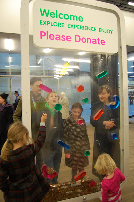
TATE Modern in London operates completely on the support of its visitors (over 8 million per year), trusts, foundations, and corporations. Therefore, it is important for the TATE to generate enough interest in people to make donations and keep the functions of the museum going.


Donation is an act of willingness and care. Most donation boxes remain empty as people don’t feel motivated enough to participate in the donation process. Designers of TATE donation box have made efforts to understand the motivational aspect of such donation activity. They have designed the box to enhance the whole experience of donating a few pence with a sense of play and achievement.

The donation box has been designed in such a way that when donors drop coin into the box, it doesn't reach the bottom immediately. Rather it stumbles down from one obstacle to another placed on its way down the bottom. People (especially kids) make multiple attempts to make sure that it takes long for the coin to finally settle at the bottom of the box. This experience is quite opposite to the one that we get while playing Tilt Maze Game where the objective is to bring the metal ball in the center of the maze as quickly as possible.

TATE offers a range of attractions for all kinds of people (tourists, art enthusiasts, artists, and designers), including kids accompanied by their parents, who come to explore and witness the various art lead happenings in the museum. While kids are not real donors, they happen to be the biggest participants in the donation process at TATE. Children accompanied by adults (mostly parents) get fascinated with whole process of donation as a playful activity without really understanding the reason of it. TATE exemplifies in best of ways how experiences that are designed keeping people's context, activities, and motivations in mind are far more effective than other initiatives.
Read More
Posted in London, TATE, User Experience Design | No comments
Newer Posts Older Posts Home
Subscribe to: Posts (Atom)

Popular Posts

  • Is ‘Responsive Design’ Enough? Don’t Forget the ‘Context’
    The number of consumers using smartphones and tablets to access websites, brands are increasing. This had led to reconsidering how to design...
  • “Tizen” Knocking the door… Do we really need another Mobile Operating System?
    R eports have confirmed that “ Samsung ”will be using “ Tizen OS ” for its new upcoming high-end smart phones. Well the smartphone domain is...
  • Mobile Barcodes, The Next Generation mode of marketing
    Is there a segment of the communications market more exciting and more rapidly evolving than the mobile space? Hardly. While it wasn’t the f...
  • Can Gamification help achieve better adoption?
    You can lead a horse to water but you can’t make him drink. This proverb holds a lot of meaning in almost everything we do in our life, espe...
  • The not-so-smart market shares of smart phones
    We shouldn't be surprised if the latest IDC figures make Andy Rubin do it the Gangnam style. Android notched up 75% of the smartphone m...
  • Sarit Arora talks about Emerging UX Trends & Practices at 'd+b Talks'
    Few days ago, Sarit Arora from Yahoo! visited our campus to give a talk on 'Emerging Interaction design trends and User Research for Inn...
  • This week at d+b talks
    This week at d+b talks, Sarit Arora from Yahoo talks on 'Emerging Interaction Design Practices' and 'User Research for Innovatio...
  • Championing the LUV of Design
    This has been contributed by Swarupa Manjunatha, an employee of MindTree. Netdiver Digital Culture Magazine. Yup! That’s it. A one stop shop...
  • Accessibility Testing: Underutilized Today
    Making sure that your website or application is accessible to all types of users (like the vision, hearing, cognitive, literacy, and the phy...
  • What Game Designers Do That Interface Designer Don’t
    At many occasions stakeholders ask designers to design experiences that are simple yet immersive and engaging for commercial Web application...

Categories

  • Accessibility
  • Accessible Software
  • aesthetic
  • airport
  • assitive technology
  • augmented reality
  • bangalore
  • brainstorming
  • cellphone
  • collaboration
  • Commenting
  • conference
  • content
  • content design
  • context driven design
  • crowdsourcing
  • Customer Experience
  • d+b Talks
  • dawakhana
  • delhi
  • design
  • design for mobile
  • design fridays
  • design mela
  • Design should be Fun
  • design thinking
  • digital experience
  • disable
  • drawing
  • e-reader
  • elements of signage
  • engaging experience
  • Experience Touch
  • Game Design
  • GIDS
  • Graphic Design
  • Graphics
  • guidelines
  • Haptics
  • HTML5
  • Icons
  • ideation
  • India
  • Indian Railways
  • Information Architecture
  • innovation
  • inspiration for design
  • interaction design
  • interaction pattern
  • Introduction
  • iOS
  • ipad
  • ipad 2 usages
  • iterative design
  • laptop
  • Latest Trends
  • leaptop
  • London
  • long term memory
  • LTM
  • megids
  • mela
  • microsoft
  • MindTree
  • mobile
  • mobile context
  • mobile experience
  • online experience
  • opnions
  • Osmosis
  • pattern
  • PC
  • Persona
  • personal computers
  • personas
  • photo storage
  • photos
  • physically challenged
  • Pictogram
  • Pret
  • problem
  • product design
  • QR Codes
  • Rapid Prototyping
  • Reference
  • Reservation Engines
  • Responsive design
  • Salary Survey
  • Search Engine
  • service design
  • session
  • short term memory
  • sign
  • signage
  • sizing the content
  • sketching
  • smartphone
  • Social Networks
  • solution
  • solutioning exercise
  • spastic society of karnataka
  • splash screen design
  • STM
  • street sign
  • tablet
  • tag
  • Tangible User Interface
  • TATE
  • Text input
  • thoughts
  • touchscreens
  • traffic sign
  • translation
  • travel
  • tree based navigation
  • TUI
  • ui patterns
  • url
  • usability
  • Usability Analysis
  • User Experience
  • User Experience Design
  • UX and agile
  • UX design and salsa
  • UX design principles
  • UX planning
  • Video
  • viewport
  • Visually Challenged
  • web experience
  • welcome screen
  • yahoo
  • YouTube

Blog Archive

  • ▼  2013 (2)
    • ▼  July (1)
      • Is ‘Responsive Design’ Enough? Don’t Forget the ‘C...
    • ►  March (1)
  • ►  2012 (5)
    • ►  November (1)
    • ►  June (1)
    • ►  May (3)
  • ►  2011 (23)
    • ►  November (1)
    • ►  September (2)
    • ►  August (1)
    • ►  July (5)
    • ►  June (3)
    • ►  May (4)
    • ►  April (3)
    • ►  March (2)
    • ►  February (2)
  • ►  2010 (13)
    • ►  November (3)
    • ►  October (3)
    • ►  September (1)
    • ►  August (3)
    • ►  July (1)
    • ►  June (1)
    • ►  May (1)
  • ►  2009 (13)
    • ►  October (1)
    • ►  August (1)
    • ►  June (2)
    • ►  May (1)
    • ►  April (1)
    • ►  March (1)
    • ►  February (1)
    • ►  January (5)
  • ►  2008 (24)
    • ►  December (3)
    • ►  November (5)
    • ►  October (3)
    • ►  September (3)
    • ►  August (2)
    • ►  July (5)
    • ►  June (3)
  • ►  2007 (1)
    • ►  May (1)
  • ►  2003 (1)
    • ►  May (1)
  • ►  2002 (1)
    • ►  September (1)
Powered by Blogger.

About Me

Unknown
View my complete profile