- Everyone does not have a Smartphone
- Every Smartphone user does not know how to use a QR code
- Smartphone user who knows about QR code may be fed up of seeing them everywhere
Saturday, 14 May 2011
How to use QR Codes, or rather, how not to use QR codes!
Saturday, 7 May 2011
Information Design for Product Display on e-Commerce Websites
Many times there is too much of information, too much data, or too many options and choices to make sense of. Users can easily become frustrated or disengage if they can’t find a connection with what is presented to them. One such example is e-commerce websites serving millions of products across thousands of categories.
Most e-commerce websites serve product information in a list or in a grid view. Facet search panel on left comprising either check boxes or links, with bracketed number of products inside each category, is another universal pattern used for product retrieval and filtering. For example, a website selling digital cameras, printers, or flat panel television sets will allow users to filter assortments by technical information such as megapixels, aspect ratio, screen size, FPS, make, model, and more. Most of these facets are not useful for people to make buying decisions anymore.
Few websites show number of reviews to prove product popularity in the market without caring for how long the product has been there on the shelf. Comparing product features is not desirable either because it just rearranges the technical information in a big table where each product is a column and users are forced to scan the information row-by-row to understand which product is better over others. And as mentioned before, technical information does not anyway affect people's choice of product.
BE HUMANE
When people buy items of such kind as mentioned above, beyond the technical information they are interested in the purpose and use of such products. Let's take an example of an office purchase manager searching for a large flat panel television to be used in a conference room with a seating capacity of 10 people for presentations and Internet video calls. Internally, it can be mapped to technical information such as resolution 1024x768, low priced, and Internet ready, and more. Similarly, let's look at a man who wants to buy a digital camera to capture his son’s Tennis game. Suitable camera can be internally mapped to technical information such as high FPS, bigger aperture, and in-built filter, and more. In both examples, the important point is that people want to buy stuff that is aligned to their needs. They find it very difficult to map their needs to the technical search/filter/compare criteria provided by websites.
A designer should experiment with visual/information graphic facets that will allow people to filter and compare products on their practical and emotional needs instead of technical information alone. A very simple visual representation of information can help people make better decisions, and understand something that's really complex, and connect them emotionally.
POPULARITY
A product’s social popularity on the Web has become very important. Buying decisions have started to get influenced by people's online reviews of a product. It is time that e-commerce websites graduate from traditional popularity display patterns. Merely showing information such as "number of people recommendations," "number of people liked or disliked" or "number of reviews" is not good enough anymore.
Interface designers need to start experimenting with ideas that can generate popularity based on people’s reaction in a particular context, time, and specific need. For example, one could use data visualization, like pie charts, scatter plots, and relationship circles to compare two point-and-shoot cameras and display one being more popular than the other among amateur photographers for taking home pictures and not so popular among professional or wildlife photographers along with comparative results achieved. Such generic visualization patterns will add depth to the user interface and eventually make it more useful for buyers to make right decisions.
Friday, 29 April 2011
Why should one go for iPad : iFAD?
There were mixed views for iPad. Some were of the view that iPad is a great product with advantages of being light and easy to carry. One can carry it along for presentations or on travel to read. Many others were of the view that a laptop can do much more than just presentations and reading. Finally, a general consensus was formed that probably "an iPad is a rich man's second laptop"!
Not long ago, we had termed laptops as "rich man's second computer", I didn't even realize when we moved ahead of that era, now I rarely see those big Personal Computers being purchased with as much vigor. Everyone seems to get Laptop or even better a Netbook. So, the confusion gets even worse.
Some more points to be pondered on.
- The smartphones are becoming smarter. I think by the end of 2011 we will have smart phones with 3D projection capabilities, connectivity to all sort of networks and of course a processing power that can bring a laptop of today to shame!
- Do we recall a device called "Pager"? It was a sort of "Twitter" on the go! Wasn't it revolutionary? Where did it go?
- How many devices can a person carry without getting pissed off? One of my teachers once told me that a person can't manage more than 2 activities at a time: home and office, office and personal relationship, personal relationship and studies, studies and office. I think that time has been a proof for that statement, and I firmly believe in it. Extending the same theory, I am of the opinion that a person can't manage more than 2 devices successfully. Most of us must be having a laptop and a phone. If I bring in a iPad along, then one of the 2 former devices have to go! Either a laptop or the phone.
- It is unlikely that we will go away with a phone. What else can we put in our pockets, hold in our hands and talk for hours on? Surely not an ipad! Until and unless we have custom designed clothes to hold them :)
There is no conclusion to this post. Rather, I am still confused on where we are heading to. Conclusively, I can only say that out of Laptops, Netbooks, Leaptops, iPads, phones, smart phones, smarter phones, Kindles, Adams and ... we will have to choose only 2 devices at a time. Most of the devices will converge into others and new devices will evolve over time. More fads will come, some will stay some will not even be mentioned in history.....
Sunday, 24 April 2011
GIDS conference: My Experience
The conference began with “Building the next generation of experiences” by Arijit Chatterjee. Arijit is Engineering Manager for Platform Evangelism at Adobe Systems India. The trend of preferences for people is changing. Everyone wants to have better experiences, be it food, clothes or digital experiences. The experience has moved on from desktops, to laptops, to tablets and currently to smart phones. People want to have a meaningful, easy and engaging experience. There are essentially three areas of innovation in this:
1. Content authoring for the creators,
2. Customer experience management for businesses and
3. Online analytics and optimization to ensure the best value being delivered.
This session was followed by "Designing User Experiences for multi screen applications with Flash, HTML5 &CSS3" by Harish Sivaramakrishnan. Harish is a Platform Evangelist at Adobe Systems. He is also a UX design and usability expert. His talk highlighted the various devices available for communication, work etc today. The talk explored the possibility of designing the same user experience across all the different form factors i.e tablet, ipad, smart phones, desktop etc. Some practical ideas to be used by the developers to efficiently complete the coding , and the code that can be reused across all the different form factors, different screen resolutions using Adobe Flex, Flash, HTML 5 and CSS3. The programming tips and tricks were shared in these 3 platforms.
"HTML5 more than HTML5" was an interesting and thought provoking talk by Harish Vaidyanathan, who leads the evangelism efforts for Microsoft India. This session explored HTML5 and the session gave summary of HTML5 features. The session started with quick note of the logo design of HTML, and moved on to the features. Features include button curves, shadows, gradient can be done directly by coding. The button can have 4 different curve radii for 4 corners, button/ object can have shadow by placing lights .The best part is that while coding the screens can be checked by viewing in all the resolutions of different form factors. HTML5 combines the designer and developer skills and hence bridges the gap. Harish also gave aother session on "Unleashing a more beautiful web", some of the content was repetition of HTML and few features of IE 9.
"Towards a humane interface, aesthetic and usability" by Venkat Subramaniam. Venkat is the founder of Agile Developer,Inc. He has significant experience in design, architecture and development of software applications. The session gave an insight about usability in everyday interactions. Usability is more than just a “WOW” factor, it is more about making an application easier and intuitive to use. A successful application has to focus on three dimensions: business, design and usability. He gave few hilarious examples of User experience gone wrong in various products that he has come across. A spicejet check-in kiosk, Honda car to a programming language. The examples drawing to a very crucial point about Keep it Simple Stupid (KISS) rule. This was a fantastic simple session and will be sharing the presentation to MT UX community once i get my hands on it.
The conference gave insights on the changing technology and its usage. A better world of tomorrow for designers and developers .
Thanks Ankush for reviewing the draft.
Wednesday, 20 April 2011
What Game Designers Do That Interface Designer Don’t

(Over simplification of Web application design)
They make sure all the business rules are incorporated, the right system response is in place, the right set and amount of information is presented so the right decisions are taken and so on and so forth. I would also go ahead saying that there is nothing grossly wrong with that approach. And while the results are not always great designs, they are not bad either.
But there are traits of game designs that an enterprise application designer can experiment with and design experiences that are memorable and desirable for people who use them. Theoretically, game design is not all that different and designers from other fields are perfectly capable of doing much of what game designers do.

[A gross oversimplification of game design (Stephen Anderson’s way)]
Instant Gratification vs. Slow Response Time
In most commercial software interfaces response time management is completely overlooked. The rule is “faster is always better,” and Google has almost mastered it. Search results displayed are shown with how many milliseconds it took for Google to process the results. However, game designers don’t think likewise and they defy the concept of instant gratification by making a good use of response time. It is like one driving to a hill station on a vacation with friends and family where en-route experiences are equally important as reaching the destination is. Slow response time also allows users to think of their next move.
Closure to Completion Effect
Gamers become more aggressive, thrilled, and impatient when they come very close to completion of a level, task, or an activity in a game. But game designers design these activities to be highly unpredictable and vulnerable, to take the gamers' excitement to the peak (for example, a game of Jigsaw Puzzle or Sudoku at the verge of completion). Similarly, Web application designers can start thinking of ideas to make the last piece of a task or an activity more engaging and exciting.
Learn To Become More Efficient In Future
Gamers become more efficient as they play and eventually become experts at it. Game designers leave cues that gamers use as tricks and keys to reach the expert level. The vast majority of software user interfaces have no consideration for how users can be taught by experience with the system to improve their performance. It is about finding those hidden patterns in the way people interact and manipulate the system. It is an applied learning that a user gains and reuses in different conditions to get faster results.
Short-term Memory Management
People love gaming because it challenges their reflexes, thinking, intuition, and dedication as they make progress on higher levels with increased amount of complexity. Short-term memory management is a great tool for game designers to increase or reduced the complexity of the game. Interface designers are trained not to rely on user’s short-term memory (for example, showing a piece of information and expecting the user to remember it to reenter the same somewhere else in the system).
However, game designers use it quite often in forms of locations, maps, symbols, and passwords which the gamers need to remember to clear a level or to reach a place. For example, arcade games use word codes that are displayed when the level is completed. These codes are supposed to be remembered by the player to reenter to reach that level directly from beginning else he or she will have to pass through all the previous levels to get there. Similarly, the famous AngryBird game shows the cage structure once to the player and leaves it to the player’s imagination to strike in the right area.
Building Mystery
Game designers carefully design interactions that in a way expand the player's mind and force him or her to think what’s happening. It is the mild confusion created with just enough context to consume the player’s cognition in subtle and compelling ways.
Enterprise Web application designers think of making interaction highly intuitive and transparent at all times. They think of giving surprises by making the application learn users patterns and start intelligently predicting their next move and automate it.
Sunday, 27 March 2011
MindTree UX Unveils the Mask @Osmosis ‘11
At MindTree, it was again the season of Osmosis, the company’s annual event which is a platform to showcase and share knowledge of different verticals and groups with the rest of the MindTree Minds. For the MindTree UX team it was again a time to decide how to participate. We decided we’ll do something engaging and from then on there was no looking back. Two weeks in advance, our event planning began by creating a task force. We went crowdsourcing, looking for ideas, subjects, and disciplines which can be showcased as part of the overall theme of the UX stall. Our hunt for ideas generated umpteen ideas such as:
- Beyond the ‘Social’ Network: how social network is being used for non-social purposes (both good and bad)
- Immersive experiences: How the video games and 3-D technology will merge to create more immersive online experiences
- Green design
- The four dimensions of Information Design: beyond the organisation, that is, space and time
- Information is a continuum (and not discreet interactions on individual devices)
- Simplexity: how future systems will be designed ‘simple to interact’ feel with complex backend logic and processing behind the scene
- Information overload
- Connecting ideas and not pages (making sense of unstructured data)
Every idea sounded interesting. Unanimously the team decided to pursue a theme that impacts thinking of people in the system, that is, knowledge of user experience and its impact on people and business. In other words, an attempt was made to educate people that user experience design is not about making pretty screens. Design of a pleasing, usable interaction requires effort from various disciplines such as graphic design, information design, interaction design, human factors, psychology, usability, ergonomics, and knowledge of business and technology trends. We wanted to convey the message: “UX is not just about pretty face.”
UX Osmosis stall was inaugurated by our youngest UX designer Ramshi Hamza. We designed the stall to attract and encourage all to participate in Osmosis. We all joined together to have fun.
The concept of ‘Time Travel: Design, Business & Technology’ was the lead communication (10ft by 5ft flex poster) designed by Vallabh, Baizil, and Ankush. The poster showed design, business and technology advancements over the last 15 years, with the intention to describe how the ‘push and pull’ between technology, business and design has forced each other to reinvent. It also showed how many other disciplines such as human factors, psychology, usability, ergonomics, and anthropology became part of the mainstream design practices. We asked participants to come and share their views on what they think the future of business, technology and design would be. We got some interesting responses that we will be publishing in the later issues.
Some of these videos showed the futuristic designs especially about ubiquitous computing and some user interviews that we carried out to understand the behavior with respect to social media spaces. We discussed immersive experiences through examples of work done by other design practitioners. But the actual learning of immersive experiences came only by experiencing Microsoft Kinet (Thanks to Danny for making the arrangements!). Many MindTree Minds joined us playing and enjoying the game irrespective of their position, age, etc. Watch the videos to watch them play!
We wanted to engage people in a design lead activity where they could feel a sense of participation and achievement. We made 20 paper boats with cartridge sheets and provided paints and brushes to people and asked them to unleash their creativity and talent. We allowed them to be creative in their own ways. Very quickly we realized that we have 20 people painting at a time and almost the same number waiting for their turn. We had to arrange for more paints, brushes, and boats. At last we ended up with 140 boats painted by MindTree Minds that are now available as a collage fixture at fourth floor in the Phase 1 building of MindTree West Campus. On an average each participant spent 10-15 minutes painting a boat; such an immersive participation would be difficult to achieve in an art competition. Thanks to Diba, Shobha, Ramshi, and Vinay A. for making it happen.
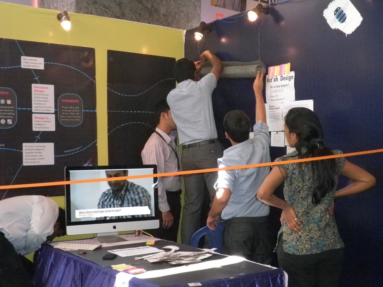
Vot'ah design: Participants were asked to vote for the purpose of design. They were asked whether "Design is problem-solving" or "Design is fun". Two examples used for illustration were:
- Design is fun: A glider that is designed to capture unusual video shots from different angles in the air. Users will launch the glider in an open space; a small camera mounted on the nose of glider will record video of people on the ground.
- Design is problem solving: An electric socket that is designed to accept any pin size and voltage and has an extension cord, if required, with capabilities to carry mobile phone on top.
Participants were asked to choose a theme and also leave a comment in support of their choice. In three hours, there were 80 people who had voted and of which 65% chose design more problem-solving than fun. The other activity was to hunt for web parts (treasure) or broken web page components to build as one. People were given two choices of designs before they started playing the game. Thanks to Natraj and Shobha for designing and executing such learnable experiences. The Osmosis UX stall was a wonderful example of superb coordination, self-motivated team-work, and a sense of expression and play. I sincerely thank Ankush, Baizil, Chinmoy, Danny, Diba, Hetna, Mukesh, Natraj, Ramshi, Vallabh, Veena, Vinay A, Vineet, Satya, Shobha, and all the participants for their contribution and support.