Experience Design

  • Subscribe to our RSS feed.
  • Twitter
  • StumbleUpon
  • Reddit
  • Facebook
  • Digg

Wednesday, 6 July 2011

How to Design sized web content for Mobile web

Posted on 23:09 by Unknown
Previous post highlighted some of the guidelines that will help, while designing for mobile web.
But if we specifically talk about iOS, then it has capability of displaying content designed for desktop. So same content can be used across devices.

iOS displays existing web content in two ways, it can display the web content on the screen resolution of the device or it can render the page at the actual size of the page and then "zoom out" to fit the page on the screen of the device. This virtual screen is called "Viewport"

What is Viewport?

It can be defined as the rectangular area ( screen) where the content is displayed.

Image below displays the "Desktop Viewport" and "Viewport on iOS"
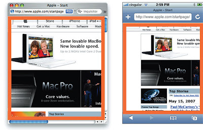


For most of the devices the screen resolution and the display size are equal to the viewport. This thing is applicable in case of desktop , laptops etc, but in the case of mobile it is different. Many pages on web, wont render well on all phones, at their screen resolution. In order to render all the pages well, mobile phone render pages on the virtual resolution and then scale them down to fit on the screen of the device.
For example: In iOS the device screen width is 320 pixels and the viewport size width can be 980 pixels, so in this case, the webpage with 980 px width, will fit perfect on the screen.


Viewport Meta Tags

Safari on iOS displays almost all the pages well, that are designed for desktop. If this doesnt work then you need to change the settings by configuring the viewport. Configuring the Viewport is easy, just add a line of HTML to your webpage. It is basically done through viewport meta tags. Typically viewport meta tag is used to set the width and initial scale of the viewport to improve the presentation of the webpage. For example : if the width of your webpage is less than 980 px, then you should set the width of the viewport to match the width of your webpage.

"Viewport meta tags are basically used to configure the width and the scale of the viewport"

If your webpage is narrower than the default width, then set the width of your viewport to the width of the webpage, as displayed in the image below:


Viewport settings for Web Applications

If you are designing web application specifically for iOS, then the recommended size of your webpage should be the size of the iOS. Apple recommends that set the width as “device-width” so that the scale is 1.0 in the portrait orientation and it doesn't change when the device is in landscape orientation.


Configuring the viewport helps resizing the web content for the device. But it will not be able to give a good user experience every time, because in some cases text will not be readable, user has to zoom in, zoom out , scroll a lot, in order to read the content, reach the targeted link etc.
Read More
Posted in content design, iOS, mobile experience, sizing the content, viewport | No comments

Tuesday, 5 July 2011

Content Design guidelines for Mobile web

Posted on 23:32 by Unknown
While creating a website the first thing that a designer decides is the appropriate dimensions for it . But when it comes to mobile, the resolution and dimensions are not fixed. They are changing very rapidly, also the lifespan of mobile devices are much shorter. The constant release of new mobile devices also adds to mobile device resolutions. So this wide variety of resolution, makes it difficult for designer to select an appropriate dimension to work on.


Figure1: This is a very limited list and not complete. It is just to give an idea about the resolutions.


To answer this problem, we need to create layouts for specific collection of devices. These layouts changes depending upon the resolution and orientation of a device, in order to enhance the experience on mobile.The main reason of this mobile resolution specific experience is the “one web” approach to the web design.

…One Web means making, as far as is reasonable, the same information and services
available to users irrespective of the device they are using. However, it does not mean
that exactly the same information is available in exactly the same representation across
all devices. The context of mobile use, device capability variations, bandwidth issues, and
mobile network capabilities all affect the representation. Furthermore, some services and
information are more suitable for and targeted at particular user contexts…

Guidelines for Designing for Mobile web

Many of these guidelines will improve the reliability, performance, look and user experience of your webpage, on all mobile platforms.

Simple
Users on mobile, quickly want to get the desired information. So mobile site should be simple than the standard site. Standard site is already simple, simplify it further more, to optimize it for mobile. This may include re doing the menus, removing images, breaking texts at certain places etc. You need to simplify the site from design and functionality perspective. Make sure that everything presented on the site should be simple, readable and useful.

Example


Lightweight

Use lightweight graphics for mobile site. Even it is good to use a simple, separate mobile theme for mobile site. Mobile theme means you can actually consider how user are using your site and then optimize it for mobile accordingly.

Example


Use Columns and Blocks

Use columns and blocks to layout your webpage like many online newspapers. If the content on a webpage, cover the full width with content, then it generally becomes difficult to read. Columns and blocks breaks the webpage into parts, thus making it easier to read and also allows user to double tap on objects on page.

Example


Limit Page Length

Include as much content from your actual site as practically possible. But include that too a limit. Don't make the user to scroll too long , to view the complete page. In a touchscreen phone its still easier to view a longer page, but also think about a user with a keypad based phone. Break the content into parts, use pagination etc to avoid long scrolling.


Don't use pop ups or open new window

Do not use pop ups or open new windows, while browsing a website on mobile. As it can infer between the browsing experience.


Don't rely on flash or java script
Not all phones support flash or java script. And if some of the phones support, then it is not sure that its the latest version. Make sure that content on your mobile site is plain HTML/CSS, otherwise large content of your site will be on risk, if users will not be able to access it.


Limit scrolling to one direction
It is really annoying when user has to scroll in multiple directions, while browsing through a site. And this become worse, if user has to browse that over a mobile phone. Limit your browsing to one direction (vertical) to give a better experience to the user.

Example


Link to the Standard site

Whatever platform users might be using, they might want to see the standard site, as nowadays many smartphones, i phones are capable of presenting the desktop site as it is. Always give a link to the main site, it can be link it the footer. It should also allow the user to go back to the mobile version from the main site without using back button.

Example


Size and Sequence

Plan the proper sequence of the content on your site, depending upon the importance of the content, buttons, navigation links etc. Interface should also be designed keeping in mind the touchscreen interface, where buttons, click able links should be bigger.

Example


References: noupe.com , UX booth, cyberdesigz.com

Read More
Posted in content design, design for mobile, guidelines, interaction design, mobile experience | No comments

Saturday, 25 June 2011

Design Thinking

Posted on 11:49 by Unknown
We had the pleasure to attend a session on "Design Thinking – Looking beyond the obvious and crafting a vision for the future" by Prof. Ulrich Weinberg, who is the Head of “School of Design Thinking” at Hasso Plattner Institute, Potsdam, Germany since 2007.

First, I will note down some key points from his session on Design Thinking and then I will put in my opinions & thoughts. 

Key points from the session:

Sustainable Innovation


  • For a sustainable innovation the process has to start with human needs. When the human needs are understood, then one has to understand how technology can support those human needs. And finally, one has to build the business case.
  • Key requirement of Design Thinking is a multi-disciplinary team. This team has to work on an iterative process in an appropriate environment. The appropriate environment for design thinking is a variable space as will be discussed subsequently.
  • Multi-disciplinary team is very important and every individual has to understand and rely on the power of team.
  • Our education systems have corrupted us in thinking only about ourselves. It has made us increasingly individualistic. But, for Design Thinking to succeed we have to think of our collective success rather than individual achievements. 
  • Iterative Process

  • In the iterative process, it is necessary that no one thinks about the solution in the first 3 steps. The first 3 steps are to:
    • Understand the problem
    • Observe the users and the problems in depth
    • Build a point of view about the users and the problems
  • Only, after building a point of view should the team move on to Ideation phase that is like a brainstorming session. The objective is to come out with as many solutions possible. "One has to build quantity before quality."
  • Iteration of the whole process is important for the success. Usually, the first prototype is only 60-70% successful after testing. And every iteration refines the solution further.
  • Many team members of the mulit-disciplinary team come from a non-creative backgrounds. Everyone has to understand that creativity is in-built in everyone. What is important is to "reactivate the skills" and bring back "creativity from kindergarten" 
    • This is also known as building up of Creative Confidence.
  • "Failing early and often" is a lesson not just for the failing student but for the team and other observants as well. 
  • How to create a flexible working environment? 
    • Lots of white boards should be placed. Enough for everyone to play with.
    • Movable furniture
    • Standing positions for team members has been found to be better suited for such process. It was observed that individuals were more active participants when standing compared to sitting. 
    • Information environment - An environment where information flow is very easy.
  • What sort of individuals are best suited for Design Thinking process?
    • T shaped people: Individuals who are good in the filed they are in, but are equally capable of appreciating and understanding other fields and people from other domains.
  • How has digital media helped?
    • Design Thinking would not have been possible without the advent of Digital Media. Collecting ideas very rapidly has been possible using this media.
My thoughts & opinions:
  • Building multi-disciplinary teams is very important for Design Thinking. But, for most of the businesses this is the hardest part. All said and done, bringing together such a team would be hard for smaller businesses or in fact for anyone except some academic institutions.
  • Multi-disciplinary team formulation does not take care of cultural sensitivities.
    • How can one solve a problem in India sitting in other parts of the world, by building a team of people who have never been to or lived in India?
  • Sustainable innovation also leaves aside the culture and society.
    • A solution may be good for user needs, technologically feasible and with a good business case, but society may see it as a threat or the solution may be culturally unacceptable. So, it should be (User Needs + Cultural impact + Societal Values)
  • Physical environment seems to be a key component of the whole process. With decreasing interactions in real world and increased interactions in virtual world, it is not clear how to build an appropriate environment in virtual world.
    • In one of our projects where we are applying Design Thinking, half the team members sit in US and half are in India. It is a real challenge to create a suitable environment on digital world. 
Read More
Posted in conference, design, design thinking, opnions, session, thoughts | No comments

Tuesday, 14 June 2011

Content Publishers Going ‘Tabletized’

Posted on 23:42 by Unknown
Newspapers were the first to realize the power of the Web to communicate instantly with their readers. Now being mobile-enabled has become increasingly important for them to stay relevant today. And as if it wasn’t enough of a problem to choose the right platform (Android, iOS), device capability, or to choose between mobile Web and native application, things have become more complicated with penetration of tablet devices (though there's no competition to iPad yet).

Tablet devices will become the biggest point of influence as to how users will interact and consume digital content. Companies such as BBC, FLUD, Wired, and many more already have their iPad native application available on Apple 'sApp store. CNN, Reuters, ESPN, SPIN.com, and NYTimes.com have made themselves aligned to iPad Web browsing experience.

However, the strategic choices will become easier for digital content publishers if they try to understand how different stakeholders of the publishing industry will deal with content in future.

Native Experience of Information


The first advantage of creating a native application for iPad is the richness of experience the app provides. Designers seem to be designing apps more as amalgamations of games and info-graphic interfaces and less as task-driven interfaces. Native applications can make good use of device capabilities such as camera, accelerometer, gyroscope, voice and motion sensor, and GPS and add to the overall experience of the application which is difficult to achieve on browser-based app designs. While some amount of offline browsing and location aware services are possible using HTML 5, it is still not possible to access some of the native capabilities of mobile devices from browsers due to security and privacy concerns (for example, access to address book or calendar).


The Wired iPad app is a beautiful example of static magazine content being made available in a highly interactive and multimedia-based content delivery format, without compromising on the magazine’s original free flow content designs, large visuals, large advertisements, and silky smooth page flip transitions. However, in many ways the content is confusing and unusable because of non-obvious controls, unintuitive interactions, and game design thinking. Read NN Group report on usability of iPad apps and websites.

Hybrid Experience of Information

Publications need to think — Does reading infotainment content always require such rich multimedia experiences? What about serious content readers who would want to read articles for hours? Does it make more sense to have subtle and clean reading experience for them?

Financial Times has designed a hybrid version of Web and native applications for their website (app.ft.com), optimized for an iPad. The website exploits HTML5 capabilities to load content in the background and provides a newspaper's page-after-page flip reading experience that is completely browser based. Users can easily differentiate the content reading experience from traditional Web content rendering without compromising the subtle simplicity.


Richness of Content is Expensive
Rich content comes with its weight and each bite of space on the iPad is expensive. Single copy of Wired magazine consumes half a gigabyte of storage space on the iPad before one can use it. Data on mobile is still expensive; downloading a copy of Wired using the 3G iPad connectivity would easily cost a fortune in many countries along with the time that it would take. And all of it will impact the end user experience.
Natural Digital Content Interactions Are Missing
In many ways native applications' designs reduce the user’s natural tendency of reading and interacting with the digital content. Features and controls that users use in browsers are not available (for example, copy text and photos and share it with friends by pasting it in an email). Features like bookmarking and printing pages are not available unless they are built seamlessly within the application.

Access and Reach
Digital content is highly search driven. To access a certain publication's content, users may use any of the search engines or they may find it via links from other websites, blogs, Twitter, and/or links embedded in emails. However, the mobile native apps currently do not support such navigation. So, if a publisher's marketing strategy is to increase the number of visitors and not bother about the repeat visitors, it makes sense to go for mobile optimized Web, especially if it is viral.

Media Advertising Means Money!
Advertising has been a primary source of revenue for most media companies across platforms. For a decade, it was believed that ‘Web users are ad blind’ and they don’t care about ads. At the same time, there has been a significant growth in various media companies' advertising budgets year after year. It’s time media content producers rethink about advertising.
Designers and marketers of traditional Web have worked on aspects like ad slots, positions, sizes, context, level of interactivity, personalization, and more but now iPad can potentially sail them far ahead in time. Ads designed for Wired app are more persuasive by being highly interactive. Perhaps there is scope to make them more meaningful, information exchangeable, intelligent and personalized by adding context sensitiveness. Advertising of such kind will certainly provide better branding mileage to advertisers and also the opportunity to get richer data in bargain. It might just be advertisers who will push publishers to go ‘tabletized’.

Editorial Control: Rigid vs Flexible vs Time to Publish
For publications that are in the business of providing real-time digital content, it is important to package content and keep updating it (for example, coverage of elections or scams). It becomes utmost important for the editorial staff to have flexibility and control over the content and presentation. Native application takes away that flexibility and control because of rigid content meta data structures and templates. Due to cumbersome maintenance and update routines in native applications and app stores, any change made to the app design can take weeks to happen. The work includes programming, testing, approval process, and then finally the end users have to actively choose to update the app. Mobile Web apps, however, require limited programming and testing, hence always providing users with the latest content and experience.
Read More
Posted in content design, digital experience, engaging experience, HTML5, interaction design, ipad, mobile experience, Search Engine, tablet, touchscreens | No comments

Friday, 3 June 2011

Content is King

Posted on 20:46 by Unknown

"People don’t read, especially when it comes to web and mobile" - I said that!
 
 
Content is important:
  • Content adds value
  • Content is part of user experience
And it is becoming increasingly important with the 'Mobile First' design philosophy coming into power. But, much of the mobile first design philosophy fails due to one big reason: CONTENT

And CONTENT failure is not a new phenomenon; it is to be seen even in web specific designs. If, we go to the root of the problem, then it is the different user behavior on web and mobile.

Keeping this in mind here are some guidelines to create content. These are applicable not just for Mobile but for web as well: 

1. If first 160 characters do not sound meaningful, rest of content cannot be useful!
With reducing attention spans, one needs to impress the audience with the first 160 characters. If an idea can’t be put in short, there will be no one listening to it. And if there is no one listening then an idea is useless. So, it makes more sense to put in all the skills to make that 160 character impressive!

2. If everything is useful, then everything is useless
Yes! There has been no mistake in the above statement. If one thinks that everything is useful for a site’s target audience, then surely there has been a mistake. Usually, we tend to fill in so much content, that everything seems to be useless and a person tends to drift away.

3. Use scan-able keywords
Every user opens a site with something in mind. If that is not scanable or searchable then it is highly unlikely that the user will stay for more.

4. Start with conclusions and recommendations
Inverted pyramid style of writing is the key for every content on web and mobile. People want to know quickly about everything; no one has time to read on and on….

5. Attention grabbing headings, meaningful subheadings
Headings are to get attention and subheadings are to make use of that attention span. Keeping a subheading simple, without jargons and to the point helps to gain trust as well. Jargons, complex terms, clever lines are meant to be for the Main heading, keep them out of the rest!

6. A picture is worth 1000 words, but we don’t want 1000 words!! Do we??
The intention is to keep it simple, neat and easy to download. A picture may seem to be the best option to give a visual appeal and represent an idea, but it increases the size. And with download speeds varying unpredictably, sometimes, pictures are a blot to user experience.
Read More
Posted in content, content design, digital experience, mobile experience, Tangible User Interface, User Experience Design, web experience | No comments

Sunday, 29 May 2011

Lost in Translation? Not Anymore

Posted on 01:56 by Unknown
A tourist in a foreign country can only dream of knowing the local language beforehand. Problems begin at the airport itself, when signage are of no help, and go all the way to the local transport, making it tough to reach places or communicate with cab drivers, and especially when it comes to restaurants' menu to select the right stuff.

When you are in such a situation, you are always worried about either running into a problem or missing out on stuff of your interest (locations, food, etc.) because you cannot communicate or read in the local language. Now, Google has launched a smart iPhone app, Google Translate, that supports translation of 57 languages.

The app allows you to translate in and out of using words or using your iPhone's microphone. While Google Translate doesn’t allow you to translate without an active data connection, you can store your most likely used translations and phrases and use them offline.


When Google Translate generates a translation, it looks for patterns in hundreds of millions of documents to help decide on the best translation for you. By detecting patterns in documents that have already been translated by human translators, Google Translate makes intelligent guesses to judge the most appropriate translation as output. This process of seeking patterns in large amounts of text is called statistical machine translation (SMT). However, in SMT, since the translations are generated by machines, not all translations are perfect.

While it is a great utility in time for travelers, it is still a machine mediator between you and the people around you who do not speak and understand your language. And the capability to translate the natural, free communication between the user and the people in real-time does not exist still. As a user of the application you are never sure of other persons’ interpretation of the translation either because of inter-language subtle cultural differences, voice and tone of the language, and/or lack of gestural explanations.

A company called Quest Visual has tried to resolve this small yet important aspect of communication. Quest Visual has invented a magical ‘World Lens’ application for the iPhone with amazing augmented really capabilities.


The application allows users to scan live views using the iPhone’s camera and translate words from Spanish to English (or vice versa) in real-time, replacing the originals in the same size, color, orientation and perspective. So now it doesn’t matter anymore whether it is a newspaper article, website content, hotel menu, or signage, all you need is Word Lens. The other exciting stuff is that the application doesn’t use active data connection to do the translations and therefore saves hundreds of dollars for travelers with active roaming data charges.

The application pushes handheld computing capabilities to make the optical character recognitions algorithms perform. The program runs the captured image through a filter to remove shadows and identify the sharpness around the text and removes everything that isn’t sharp enough. It then converts the image into black and white to further enhance text readability and do a dictionary look-up of the probabilistic text string for a closest match.

Finally, it re-renders the originally captured image by removing the original text and replacing it with the translated text string on top. Although it may sound straightforward, it is not really that simple by hand-held computing standards.
With companies such as Quest Visual creating such interesting and innovating stuff to make the overall travel experience more convenient, the future will be of an app-mesh created between augmented reality apps such as Google Goggles, World Lens, and utility apps like Google Translate with sophistication of two-way voice-to-voice translation.
Read More
Posted in augmented reality, cellphone, Customer Experience, design, smartphone, translation | No comments

Tuesday, 17 May 2011

Design for Everyone : Interaction Design for Differently-Abled

Posted on 21:20 by Unknown
“Usefulness is not impaired by imperfection”
Imagine a world with improved interaction, design of everyday things for differently able, bringing them to be a part of a country’s economic growth. This area has immense scope for designers from all disciples especially Interaction Design to benefit a social group that has not yet been able to access the full benefits of technology.


Wikipedia defines Interaction design: the structure and content of communication between two or more interactive "beings" to understand each other. Designing interaction for the applications, websites usable for differently able people aims in bringing millions of people in developing the country. Taking only the Indian context: According to WHO figure, 10 % of the Indian population is physically challenged; the Spastic Society quotes 70 million people with disabilities. The idea is to create a common platform embracing the technology and Interaction, gesture study of the differently able .Create meaningful relationships between people and the products and services that they use, from computers to mobile devices to appliances and beyond.
 
Broadly this can be categorized in broad groups i.e physical disability, sensory disability etc(http://en.wikipedia.org/wiki/Disability). Accessibility is a challenge for people with disabilities. Differences in cognitive ability, sensory impairments, motor dexterity, and behavioral and social skills must be taken into account when designing interfaces using technology, assistive technology. The subject is complex in its own special way. The thought is to:
  • Create an interaction pattern before designing a product.
    • For the products that are ergonomically well designed for a commoner would prove useless for the disabled unless some redesign done.
    • Almost all the web based applications that exist currently needs to be redesigned for the differently able.
    • The interaction of these people with everyday products is important for designers to better understand their needs
  • Study gestures minutely to know the touchpoints and movements.
  • Iterate on already used and approved products and interfaces.
  • Usability testing becomes quintessential for such products, since most of our assumptions fail in these scenarios.
  • Each person is different in its own unique way, with extensive study, a pattern can be found that leads to the design of everyday things.
( in pic: mapping different position of fingers, touchpoints, approach of thumbs and fingers )

There are many communication and interaction devices for general people, but, the current communication interfaces and services are challenges for spastic individuals. The most sought after interactions by such people include simple services like changing a TV channel, playing a game, reading a book or keeping oneself busy. These are just a few of the scenarios that needs design > redesign .

Differently abled have the capability to adapt to changes better than able population. The people around these have a exceptional ideas to redesign everyday products to suit the needs in-a-way like jugaad . It is possible to design or reiterate the design to suite the need of people with disability.


Take an example of spastic people. They have restrictive movements of muscles, hence they can’t make abrupt movements or gestures. Detailed study of only one action ,has lead to evolving Assistive Technology products like jelly bean, switches etc, Text to speech, touch typing software brings some relief for using desktop applications. These are simple ideas but very useful. Ideas as simple as these can change somebody’s life and can make them one of us.

Thanks Ankush for reviewing the draft.
Read More
Posted in assitive technology, disable, interaction design, interaction pattern, physically challenged, product design, spastic society of karnataka | No comments
Newer Posts Older Posts Home
Subscribe to: Posts (Atom)

Popular Posts

  • Is ‘Responsive Design’ Enough? Don’t Forget the ‘Context’
    The number of consumers using smartphones and tablets to access websites, brands are increasing. This had led to reconsidering how to design...
  • “Tizen” Knocking the door… Do we really need another Mobile Operating System?
    R eports have confirmed that “ Samsung ”will be using “ Tizen OS ” for its new upcoming high-end smart phones. Well the smartphone domain is...
  • Mobile Barcodes, The Next Generation mode of marketing
    Is there a segment of the communications market more exciting and more rapidly evolving than the mobile space? Hardly. While it wasn’t the f...
  • Can Gamification help achieve better adoption?
    You can lead a horse to water but you can’t make him drink. This proverb holds a lot of meaning in almost everything we do in our life, espe...
  • The not-so-smart market shares of smart phones
    We shouldn't be surprised if the latest IDC figures make Andy Rubin do it the Gangnam style. Android notched up 75% of the smartphone m...
  • Sarit Arora talks about Emerging UX Trends & Practices at 'd+b Talks'
    Few days ago, Sarit Arora from Yahoo! visited our campus to give a talk on 'Emerging Interaction design trends and User Research for Inn...
  • This week at d+b talks
    This week at d+b talks, Sarit Arora from Yahoo talks on 'Emerging Interaction Design Practices' and 'User Research for Innovatio...
  • Championing the LUV of Design
    This has been contributed by Swarupa Manjunatha, an employee of MindTree. Netdiver Digital Culture Magazine. Yup! That’s it. A one stop shop...
  • Accessibility Testing: Underutilized Today
    Making sure that your website or application is accessible to all types of users (like the vision, hearing, cognitive, literacy, and the phy...
  • What Game Designers Do That Interface Designer Don’t
    At many occasions stakeholders ask designers to design experiences that are simple yet immersive and engaging for commercial Web application...

Categories

  • Accessibility
  • Accessible Software
  • aesthetic
  • airport
  • assitive technology
  • augmented reality
  • bangalore
  • brainstorming
  • cellphone
  • collaboration
  • Commenting
  • conference
  • content
  • content design
  • context driven design
  • crowdsourcing
  • Customer Experience
  • d+b Talks
  • dawakhana
  • delhi
  • design
  • design for mobile
  • design fridays
  • design mela
  • Design should be Fun
  • design thinking
  • digital experience
  • disable
  • drawing
  • e-reader
  • elements of signage
  • engaging experience
  • Experience Touch
  • Game Design
  • GIDS
  • Graphic Design
  • Graphics
  • guidelines
  • Haptics
  • HTML5
  • Icons
  • ideation
  • India
  • Indian Railways
  • Information Architecture
  • innovation
  • inspiration for design
  • interaction design
  • interaction pattern
  • Introduction
  • iOS
  • ipad
  • ipad 2 usages
  • iterative design
  • laptop
  • Latest Trends
  • leaptop
  • London
  • long term memory
  • LTM
  • megids
  • mela
  • microsoft
  • MindTree
  • mobile
  • mobile context
  • mobile experience
  • online experience
  • opnions
  • Osmosis
  • pattern
  • PC
  • Persona
  • personal computers
  • personas
  • photo storage
  • photos
  • physically challenged
  • Pictogram
  • Pret
  • problem
  • product design
  • QR Codes
  • Rapid Prototyping
  • Reference
  • Reservation Engines
  • Responsive design
  • Salary Survey
  • Search Engine
  • service design
  • session
  • short term memory
  • sign
  • signage
  • sizing the content
  • sketching
  • smartphone
  • Social Networks
  • solution
  • solutioning exercise
  • spastic society of karnataka
  • splash screen design
  • STM
  • street sign
  • tablet
  • tag
  • Tangible User Interface
  • TATE
  • Text input
  • thoughts
  • touchscreens
  • traffic sign
  • translation
  • travel
  • tree based navigation
  • TUI
  • ui patterns
  • url
  • usability
  • Usability Analysis
  • User Experience
  • User Experience Design
  • UX and agile
  • UX design and salsa
  • UX design principles
  • UX planning
  • Video
  • viewport
  • Visually Challenged
  • web experience
  • welcome screen
  • yahoo
  • YouTube

Blog Archive

  • ▼  2013 (2)
    • ▼  July (1)
      • Is ‘Responsive Design’ Enough? Don’t Forget the ‘C...
    • ►  March (1)
  • ►  2012 (5)
    • ►  November (1)
    • ►  June (1)
    • ►  May (3)
  • ►  2011 (23)
    • ►  November (1)
    • ►  September (2)
    • ►  August (1)
    • ►  July (5)
    • ►  June (3)
    • ►  May (4)
    • ►  April (3)
    • ►  March (2)
    • ►  February (2)
  • ►  2010 (13)
    • ►  November (3)
    • ►  October (3)
    • ►  September (1)
    • ►  August (3)
    • ►  July (1)
    • ►  June (1)
    • ►  May (1)
  • ►  2009 (13)
    • ►  October (1)
    • ►  August (1)
    • ►  June (2)
    • ►  May (1)
    • ►  April (1)
    • ►  March (1)
    • ►  February (1)
    • ►  January (5)
  • ►  2008 (24)
    • ►  December (3)
    • ►  November (5)
    • ►  October (3)
    • ►  September (3)
    • ►  August (2)
    • ►  July (5)
    • ►  June (3)
  • ►  2007 (1)
    • ►  May (1)
  • ►  2003 (1)
    • ►  May (1)
  • ►  2002 (1)
    • ►  September (1)
Powered by Blogger.

About Me

Unknown
View my complete profile