


Monday, 7 November 2011
Friday, 9 September 2011
Objective: How to enhance the user experience at a Petrol Pump?
The Story:
I recently came across this problem statement, that was given to the manager of a Petrol Pump. I imagined myself to be that manager, and thought, thought hard! Then I browsed the internet to have a look at the variety of petrol pumps that we usually come across.


I also thought about some of the characteristics of a petrol pump :
Without any proof, I dare to show how a user experience curve might look like, something like this decay curve over time!
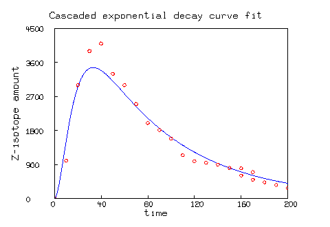 Hence, my point here is not to build the perfect service, rather build relationships over time; relationships between employees and customers, that give the necessary feedback into the system to enhance further. Here we go with my observations on how some petrol pumps do that:
The Story:
I recently came across this problem statement, that was given to the manager of a Petrol Pump. I imagined myself to be that manager, and thought, thought hard! Then I browsed the internet to have a look at the variety of petrol pumps that we usually come across.
I also thought about some of the characteristics of a petrol pump :
- Petrol is more of a commodity, with prices differing only between states. Some companies tried to create Premium products but I have seen commoditization even on those premium products. So, a person is largely indifferent on where the petrol is getting filled from!
- There might be exceptions: Example: People believe petrol available on highways might be impure and ruin their engines.
- Personnel at a petrol pump understand numbers, so one needs to indicate what and how much is required. And since, petrol or diesel doesn't usually have local names, language barriers are low.
- Services usually offered at a petrol pump: Petrol filling (obviously!), Air Check and Pollution check
- Petrol pumps are businesses of scale just like hyper markets.
- Service design -
- How many vehicles can fit in at a time?
- Maximum capacity
- How will vehicles get in?
- How will vehicles get out?
Without any proof, I dare to show how a user experience curve might look like, something like this decay curve over time!
- As soon as we enter some petrol pumps a person guides us to the shortest line, or stops us or the line to get shorter. He also indicates the approximate time required to wait. In India, usually it is 2 minutes!
- We also observe arrows to indicate the manner in which our vehicles should enter the filling areas and out of it.
- A friendly smile when we stop the car is always welcome!
- While, our vehicles are getting their food, someone comes over to ask "Sir ji! Shall I clean your windshield?" So, by the time the refilling id done, your windshield gets a makeover!
- If you are paying by card, there is an apprehension as the cashier takes the card along inside a queer building. To change all that some petrol pumps are now equipped with mobile card swipes for Visa to American Express! (American Express, although an express, is the least accepted card in India, according to my observations! That's why it needed special mention :) )
- I would love if someone would be able to check the tire pressure as well while I am filling. This trend is yet to catch up due to some unknown reasons. But this would be really useful!
- Extra lubricants, and oils within a hands reach is always better at the petrol filling station. Not many petrol pumps do that, hence causing that unnecessary delay in delivery the service
- Petrol pumps are also the best places for driving directions (till the days when we will each get a GPS!) So, an intelligent, direction-informed attendant is a good resource at any petrol pump.
- I think the idea of a supermart at a petrol pump has still not picked up in India. But, I have surely seen the potential for a small vendor selling ready snacks like chips, tetra pack of juices, cans of cold drinks etc.
- And finally, if the person filling up my car gives that "I know you!" smile and the greeting then it makes us feel special! We feel like sharing our car troubles with him. We also give the person tips at times! And, as we embark on our journey for user experience, this is the just beginning.... ...
Friday, 2 September 2011
What do you think is the biggest challenge in an Ideation exercise?
Why do you think, most of the solutions fail?
Why does even research does not bring out all the issues?
How can you hold a brainstorming session to build a solution more fruitful and effective?
As we deal with these barriers and many more, we realize that there is a key to at least put ourselves on the right track. The key is obviously driven by the capability of the people working on the problem. But, as long as a conscious effort is made to remember the key, we would not lose our focus.
And, no we are not going to suggest that building a clear objective is the key. Although, we do not deny the importance of building a clear objective, but we are going to delve one level deeper. And we are going to explain it with the help of some examples.
So, what is this key? The key is to understand the underlying systems, components, players and influencers before jumping on to solutions. In other words, it is necessary to first understand what the problem is.
 |
| Right Approach |
 |
| Wrong Approach |
Now, let’s go through some examples:
Example 1:
One of the big problems in South Africa that people were trying to tackle was human-elephant conflict. Elephants used to encroach on farmland and destroy livelihoods. In response, some farmers resorted to poisoning or shooting elephants.
Environment conservationists jumped to solutions for solving this problem. All kinds of modern technology solutions were proposed, and many trialled: Electric fences, RFID tagging, sensors and live-GSM-tracking among them. Most of the solutions failed since they were not replicable, scalable, and/or affordable.
Solution: Elephants run away when they encounter bees. According to this BBC article, early research in Kenya indicates hives can be a very effective barrier, so much so that 97% of attempted elephant raids were aborted. Where satellites, RFID tags and mobile phones failed, humble honey bees proved to be the answer.
Also note how honey bees also proved to be an alternate source of income!
Example 2:
Wimbledon had an interesting battle on and off the courts: against the pigeons. Each summer, as tennis players battle it out on the lawn courts, the authorities used to battle and stop pigeons from interfering with the play. Authorities armored themselves with all sorts of modern technology that was available: lasers and radio controlled aircraft to gas guns and ultrasound emitters. Now, we can understand what the courts would have looked like with all equipments, like a battleground?
Solution: Now, if we look from a pigeon’s perspective, all these high tech equipment might be dangerous, but nothing is a match to a bird of prey! Hence, Wimbledon’s answer doesn’t involve anything more high-tech than a bird of prey! A few laps by Rufus, the hawk, around the tennis courts are enough to scare the hardiest of pigeons away! (Source: http://www.bbc.co.uk/news/business-13939805)
In India, we solve a similar problem of monkeys using langurs to scare them off!
Example 3:
One very big cosmetics company in Japan received a complaint that a consumer had bought a soap box that was empty. Management of the company immediately traced the problem to the assembly line that conveyed all the packaged boxes of soap to the delivery department. For some reason, one soap box went through the assembly line empty.
Management asked its engineers to solve the problem. The engineers worked hard on the first solution that came to mind, using X-ray technology. They devised an X-ray machine with high-resolution monitors. Two workers were deployed full-time to monitor all the soap boxes that passed through the line to make sure they were not empty. They managed to solve the problem but it was an expensive solution.
Solution: The solution was taken to the assembly line and the installation was started. Out of curiosity, one of the workers asked about the installation. On hearing the whole story, he told his engineering manager that the solution was much easier – install a fan- it will blow away all the empty boxes and the assembly line will deliver only full, heavier packages!
Conclusion: As our world is becoming more complex, our problems are becoming even worse! We have numerous methodologies to solve these complex problems, but we observe, increasingly that these solutions are not s effective or efficient as we would have liked them to be! The reason, which we also call the “key”, to get our final solution right to a greater extent is not to jump onto solutions. Some of the examples here might help us in realizing our shortcomings, hence, improving our methodologies and thinking!
Wednesday, 17 August 2011
So we have new iPAD, iPAD 2, iPAD 2 3G! Phew! That’s a lot!!! But what do we do with this new luxury iitem? It is a gadget that can replace a number of other products. I am sure there must be some really wonderful usage of the iPAD. Here is a compilation of some iPad usages from internet and own experiences.
1. Surf the Internet
iPad is the best way to experience the web. View whole pages in portrait or if you may like it, in landscape on the large Multi-Touch screen. And let your fingers do the surfing. You can sync your bookmarks from your Mac or PC, and add even more right from your iPad. Besides, MobileMe keeps your Safari bookmarks in sync on your iPad, iPhone, Mac, and PC - wirelessly and automatically. So no matter where you go, you'll always have the most up-to-date information at hand.
2. Games
 t's great for playing simple little games. There are many free gaming applications for the iPad already. If you're willing to pay for games, then there are many to choose from, many are made specifically for iPAD.
3. E-mail
It's ideal for checking e-mail and sending short e-mails, especially when you're on the go. There's nothing like the Mail app on iPad. With a split-screen view and expansive onscreen keyboard, it lets you see and touch your email in ways you never could before.
4. E-reader
With the new iPad. you can access all of the books on Amazon, just like a Kindle, but the display is much bigger. You can view your book in portrait or landscape, and the way the pages flip is awesome - you flip it with your finger and it looks just like a real book.
5. Photo storage and viewing
The iPad is great for storing and viewing your photos because of the large display and the way that you can flip easily from one photo to the next, and jump between folders with ease.
6. Music
The big, beautiful iPad display lets you browse your music collection by song, artist, album, genre, or composer with the touch of a finger. See your music as full-size album art. Flip through all your albums and tap to choose what you want to hear. iPad makes music look as good as it sounds.
7. Recipe book
It's great to have in the kitchen with you when you need to follow a recipe since it takes up much less space than a laptop. There are many great recipe websites, plus there are many free apps related to recipes and cooking.
8. Voice Over Internet Protocol (VOIP) i.e. Skype
 The iPad has a speaker and built-in microphone so it's ideal for making phone calls over the Internet, and watching the video as well in iPAD 2! Tried this recently and absolutely loved the experience.
9. Movies
Great for using on airplanes or even at the gym, the iPad has a big screen and is great for watching films, especially when compared with a cell phone or an iPod.

Great for using on airplanes or even at the gym, the iPad has a big screen and is great for watching films, especially when compared with a cell phone or an iPod.
10. Weather & News
 Apart from e-mail and Internet, this is probably what the iPad is most used for at our house. There are plenty of great apps for quick news and weather reports at your fingertips, many of which you can customize to your own interests.
Do you have more ideas/ usages? Go on…add here.
Monday, 18 July 2011
Airport is a place, where we are bound to come early for Check In and other formalities. As I reached Bangalore Airport and Delhi Airport 2 hours earlier to the scheduled departure, I wandered around and wondered.......

Some of my observations:
"People are actively seeking for solutions!"
Do share what other opportunities come to your mind, or what other observations do you make while in an Airport?
Some of my observations:
- People go around looking for something new and exciting around the airport
- A BMW kiosk was the center of attention. The Kiosk displayed BMW cars and at the bottom gave information about the airport.
- Many people were also going through the display of clothes by many Fashion retail houses like Tommy, DKNY etc. Interestingly I could not find even a single person buying or even trying out the clothes. But, some people were buying small accessories, chocolates, sweets and most of the people bought eatables and food items.
- Regarding food items, I have observed that people are increasingly buying packaged food to be consumed on flight. This is becoming a phenomenon after low cost airlines have become a rage. These airlines do not provide "free" food on flight, so, I believe people find a wider variety and better deal on airports rather than on flights.
- Foot Massage chairs are usually kept for demonstration in malls and were available here at airports too. Noticeably, only a few use the chairs available at malls but at the airport, there was a queue to have a demonstration for the same.
- As soon as the newspapers came in, everyone jumped on them. Almost everyone picked up every newspaper daily possible. As I watched a couple of people, they browsed through the spicy parts of the newspapers and then kept them aside. Only a few went on to read some news articles in details. All such papers went into either waste baskets or got collected by an airport staff (I think to be sold in junkyard).A few people also saved the newspapers for the journey.
- When we got onto the flight, just a 2.5 hours journey, the observations were even more interesting.
- Most people fiddle around with every object around them
- The flight magazine
- The safety manual --> Some keep it back as soon as they pick it up, dejectedly, but others pick it back to read.
- People cannot make any calls using their mobile phones on flights. But, they keep playing with the device, just in case it would come alive and get them some entertainment (engagement)
- Alas, some people start small talk with their neighbors over silly things such as: how rude was the airhostess, weather, India etc.
- When we touch down, then somewhere in the back of our minds is there a tiny doubt over our luggage: Will we get it back? When will it come? Is it broken?
- Public transport and public transport information from the Airports is still not all that great, although we get some options: Buses, Taxis, Metro, Shared Taxi, Autos, Shared Autos; but the challenge is in identifying what suits my needs best and how to know about it.
"People are actively seeking for solutions!"
Do share what other opportunities come to your mind, or what other observations do you make while in an Airport?
Friday, 15 July 2011
Walking on the streets of Phuket, unbelievably thirsty, of all the Andaman Sea water around me, I wanted a fresh water tap/ bottle and I spot a familiar water tap sign. What a relief!!! A foreign country, an unknown place, language differences and a sign that is literally water to thirsty!
Signage is any visual graphics created to display information to a particular audience. It is a crisp information display that can be globally understood. The most common places for display are Roads, Hospitals, Public Places, and Airport. Signages are designed with smart appropriate usage of following elements:
Signage is any visual graphics created to display information to a particular audience. It is a crisp information display that can be globally understood. The most common places for display are Roads, Hospitals, Public Places, and Airport. Signages are designed with smart appropriate usage of following elements:
Shape: The various needs lead to range of shape. Rectangular -the most commonly used shape appropriate to display information. There can be a picture and text to convey the message within the shape. Triangle, Square, Hexagonal, Circle, Oval, Block arrow are other shapes used across the world.
Color: The basics of color psychology using red to show stop, danger; yellow for Alert; green- positive sign to give permission. Various background colors example white, yellow, and black to enhance the graphics, text used in the sign.
 Fig 1: Shapes and colors for signages
 Pictures/Graphics/Pictograms: A sketch, outline or picture of known objects, Graphics of relative things and beings. Adding graphics to signage’s helps in relating the sign.
Text: Alphabets, alphanumeric characters are used in signages. The usage of variety of font types, font size, Font colors. The text can be country, language specific.

Fig 2: example showing signage’s by combination of the elements
These elements can be used together in various permutation and combination for a Signage Design.
There are different types of signage’s to serve variety of purpose. A signage can be to direct the person to the right information, guidance, Branding. Based on the purpose it serves, broadly signages can be:
Street/Traffic Sign: Seen in every part of the world. Used to identify traffic roads, traffic rules, types of roads.

Fig 3: Traffic Signs
Banner Sign: Banner is a flag or other piece of cloth bearing a symbol, logo, slogan or other message. Banners are used mostly for advertisement, Marketing.
Commercial,Public Places signage: These are pictorial or brief text signages used in various commercial, public places. These signage’s help to identify the required information.
 Fig: 4 Signage’s example at Public Places
 The Usage of the signage’s helps in finding the way, expanding the information reach beyond language and cultural barriers.
Thursday, 7 July 2011
Often I come across different viewpoints on Experience Design discipline about what it is and what exactly experience designers do. The executioner’s (in software business) school of thought is that experience design is the practice of designing technology products and services (each of which is a human experience) based on the consideration of an individual's or a group's needs, tasks, desires, beliefs, knowledge, skills, experiences, and perceptions. Thus, it results into achieving certain user goals and leads to a successful system acceptance by users.
The other school of thought is more at an abstract level that defines experience design as a discipline of designing mental journeys that leaves the customer with memories of having performed something special, meaningful, engaging, with sense of achievement or just fun and entertainment.
Like any other discipline, I think experience design can also be understood as an organized production system that is about creating output in the form of desired experiences using available inputs such as knowledge and ideas, and finally using resources in the form of design processes and skills.

Let’s take an example of thematic restaurants. Today, food is more of an experience rather than a necessity, as only a minor part of the average income (approximately 10 per cent) is spent on food.
Dining is a combined body and mind (sensory) experience and has aspects of culture and society. The body tastes, smells, sees, hears, feels and digests the food. The mind reads the food consciously and unconsciously in the form of activated emotions and memories.
Theme restaurants are cautiously designed to deliver customer experiences by influencing customer’s state of mind with the right ambiance, environment, lighting, music/live performance, and personal service on top of the food served to stimulate emotions like happiness and so on. A great deal of skills and processes are required to accomplish delivery of such desired experiences in the restaurant business.
Another example could be watching theater, which is another form of immersive experience thoughtfully crafted for audience. The stage performances are scripted around a theme to entertain and educate audience (selective sometimes) by stimulating emotions such as anger, happiness, surprise, confusion, and more.
The two examples mentioned above can help us dissect different aspects of organized experience delivery system.

Core Activity
The core activity is what a customer wants to accomplish as a task or an activity. For example, watching a play in a theater or eating in a restaurant.
The Concept (or the ‘Feel’)
The core concept is the theme that the customer admires and what the product stands for. For example, a concept “Happiness is in small moments of life and must be shared” is the theme of Unilever ice cream brand and is well translated into the design of ice cream packaging and ice cream vending machine designs where in a customer is delivered ice cream when he/she smiles into the face recognition system. See demo
Peripheral Experience
Peripherals are supporting experiences (part of the overall customer experience) to which a customer initially pays extra emphasis. For example, the way seating is arranged, welcoming gesture at the entry, cleanliness, and so on.
Core Experience
Core experiences are activities in which a customer gets involved physically and mentally. For example, taste of the food, dialog delivery of an actor, sound and music and so on. Developing core experience is a skilled job and the output is actively consumed by customers. However, core experience cannot be appreciated without a good theme.
Support Services
Support services are materials such as cutlery, menu, and order delivery that are used to accomplish the core activity.
Such a dissection would help in understanding design and delivery of experiences. In my next blog I will make an attempt to explore how a similar approach can be applied in design for software applications.
Wednesday, 6 July 2011
Previous post highlighted some of the guidelines that will help, while designing for mobile web.
But if we specifically talk about iOS, then it has capability of displaying content designed for desktop. So same content can be used across devices.
iOS displays existing web content in two ways, it can display the web content on the screen resolution of the device or it can render the page at the actual size of the page and then "zoom out" to fit the page on the screen of the device. This virtual screen is called "Viewport"
What is Viewport?
It can be defined as the rectangular area ( screen) where the content is displayed.
Image below displays the "Desktop Viewport" and "Viewport on iOS"
For most of the devices the screen resolution and the display size are equal to the viewport. This thing is applicable in case of desktop , laptops etc, but in the case of mobile it is different. Many pages on web, wont render well on all phones, at their screen resolution. In order to render all the pages well, mobile phone render pages on the virtual resolution and then scale them down to fit on the screen of the device.
For example: In iOS the device screen width is 320 pixels and the viewport size width can be 980 pixels, so in this case, the webpage with 980 px width, will fit perfect on the screen.
Viewport Meta Tags
Safari on iOS displays almost all the pages well, that are designed for desktop. If this doesnt work then you need to change the settings by configuring the viewport. Configuring the Viewport is easy, just add a line of HTML to your webpage. It is basically done through viewport meta tags. Typically viewport meta tag is used to set the width and initial scale of the viewport to improve the presentation of the webpage. For example : if the width of your webpage is less than 980 px, then you should set the width of the viewport to match the width of your webpage.
"Viewport meta tags are basically used to configure the width and the scale of the viewport"
If your webpage is narrower than the default width, then set the width of your viewport to the width of the webpage, as displayed in the image below:

Viewport settings for Web Applications
If you are designing web application specifically for iOS, then the recommended size of your webpage should be the size of the iOS. Apple recommends that set the width as “device-width” so that the scale is 1.0 in the portrait orientation and it doesn't change when the device is in landscape orientation.

Configuring the viewport helps resizing the web content for the device. But it will not be able to give a good user experience every time, because in some cases text will not be readable, user has to zoom in, zoom out , scroll a lot, in order to read the content, reach the targeted link etc.
But if we specifically talk about iOS, then it has capability of displaying content designed for desktop. So same content can be used across devices.
iOS displays existing web content in two ways, it can display the web content on the screen resolution of the device or it can render the page at the actual size of the page and then "zoom out" to fit the page on the screen of the device. This virtual screen is called "Viewport"
What is Viewport?
It can be defined as the rectangular area ( screen) where the content is displayed.
Image below displays the "Desktop Viewport" and "Viewport on iOS"

For most of the devices the screen resolution and the display size are equal to the viewport. This thing is applicable in case of desktop , laptops etc, but in the case of mobile it is different. Many pages on web, wont render well on all phones, at their screen resolution. In order to render all the pages well, mobile phone render pages on the virtual resolution and then scale them down to fit on the screen of the device.
For example: In iOS the device screen width is 320 pixels and the viewport size width can be 980 pixels, so in this case, the webpage with 980 px width, will fit perfect on the screen.
Viewport Meta Tags
Safari on iOS displays almost all the pages well, that are designed for desktop. If this doesnt work then you need to change the settings by configuring the viewport. Configuring the Viewport is easy, just add a line of HTML to your webpage. It is basically done through viewport meta tags. Typically viewport meta tag is used to set the width and initial scale of the viewport to improve the presentation of the webpage. For example : if the width of your webpage is less than 980 px, then you should set the width of the viewport to match the width of your webpage.
"Viewport meta tags are basically used to configure the width and the scale of the viewport"
If your webpage is narrower than the default width, then set the width of your viewport to the width of the webpage, as displayed in the image below:

Viewport settings for Web Applications
If you are designing web application specifically for iOS, then the recommended size of your webpage should be the size of the iOS. Apple recommends that set the width as “device-width” so that the scale is 1.0 in the portrait orientation and it doesn't change when the device is in landscape orientation.

Configuring the viewport helps resizing the web content for the device. But it will not be able to give a good user experience every time, because in some cases text will not be readable, user has to zoom in, zoom out , scroll a lot, in order to read the content, reach the targeted link etc.
Tuesday, 5 July 2011
While creating a website the first thing that a designer decides is the appropriate dimensions for it . But when it comes to mobile, the resolution and dimensions are not fixed. They are changing very rapidly, also the lifespan of mobile devices are much shorter. The constant release of new mobile devices also adds to mobile device resolutions. So this wide variety of resolution, makes it difficult for designer to select an appropriate dimension to work on.

Figure1: This is a very limited list and not complete. It is just to give an idea about the resolutions.
To answer this problem, we need to create layouts for specific collection of devices. These layouts changes depending upon the resolution and orientation of a device, in order to enhance the experience on mobile.The main reason of this mobile resolution specific experience is the “one web” approach to the web design.
Guidelines for Designing for Mobile web
Many of these guidelines will improve the reliability, performance, look and user experience of your webpage, on all mobile platforms.
Simple
Users on mobile, quickly want to get the desired information. So mobile site should be simple than the standard site. Standard site is already simple, simplify it further more, to optimize it for mobile. This may include re doing the menus, removing images, breaking texts at certain places etc. You need to simplify the site from design and functionality perspective. Make sure that everything presented on the site should be simple, readable and useful.
Example

Lightweight
Use lightweight graphics for mobile site. Even it is good to use a simple, separate mobile theme for mobile site. Mobile theme means you can actually consider how user are using your site and then optimize it for mobile accordingly.
Example

Use Columns and Blocks
Use columns and blocks to layout your webpage like many online newspapers. If the content on a webpage, cover the full width with content, then it generally becomes difficult to read. Columns and blocks breaks the webpage into parts, thus making it easier to read and also allows user to double tap on objects on page.
Example

Limit Page Length
Include as much content from your actual site as practically possible. But include that too a limit. Don't make the user to scroll too long , to view the complete page. In a touchscreen phone its still easier to view a longer page, but also think about a user with a keypad based phone. Break the content into parts, use pagination etc to avoid long scrolling.
Don't use pop ups or open new window
Do not use pop ups or open new windows, while browsing a website on mobile. As it can infer between the browsing experience.
Don't rely on flash or java script
Not all phones support flash or java script. And if some of the phones support, then it is not sure that its the latest version. Make sure that content on your mobile site is plain HTML/CSS, otherwise large content of your site will be on risk, if users will not be able to access it.
Limit scrolling to one direction
It is really annoying when user has to scroll in multiple directions, while browsing through a site. And this become worse, if user has to browse that over a mobile phone. Limit your browsing to one direction (vertical) to give a better experience to the user.
Example

Link to the Standard site
Whatever platform users might be using, they might want to see the standard site, as nowadays many smartphones, i phones are capable of presenting the desktop site as it is. Always give a link to the main site, it can be link it the footer. It should also allow the user to go back to the mobile version from the main site without using back button.
Example

Size and Sequence
Plan the proper sequence of the content on your site, depending upon the importance of the content, buttons, navigation links etc. Interface should also be designed keeping in mind the touchscreen interface, where buttons, click able links should be bigger.
Example

References: noupe.com , UX booth, cyberdesigz.com

Figure1: This is a very limited list and not complete. It is just to give an idea about the resolutions.
To answer this problem, we need to create layouts for specific collection of devices. These layouts changes depending upon the resolution and orientation of a device, in order to enhance the experience on mobile.The main reason of this mobile resolution specific experience is the “one web” approach to the web design.
…One Web means making, as far as is reasonable, the same information and services
available to users irrespective of the device they are using. However, it does not mean
that exactly the same information is available in exactly the same representation across
all devices. The context of mobile use, device capability variations, bandwidth issues, and
mobile network capabilities all affect the representation. Furthermore, some services and
information are more suitable for and targeted at particular user contexts…
Guidelines for Designing for Mobile web
Many of these guidelines will improve the reliability, performance, look and user experience of your webpage, on all mobile platforms.
Simple
Users on mobile, quickly want to get the desired information. So mobile site should be simple than the standard site. Standard site is already simple, simplify it further more, to optimize it for mobile. This may include re doing the menus, removing images, breaking texts at certain places etc. You need to simplify the site from design and functionality perspective. Make sure that everything presented on the site should be simple, readable and useful.
Example

Lightweight
Use lightweight graphics for mobile site. Even it is good to use a simple, separate mobile theme for mobile site. Mobile theme means you can actually consider how user are using your site and then optimize it for mobile accordingly.
Example

Use Columns and Blocks
Use columns and blocks to layout your webpage like many online newspapers. If the content on a webpage, cover the full width with content, then it generally becomes difficult to read. Columns and blocks breaks the webpage into parts, thus making it easier to read and also allows user to double tap on objects on page.
Example

Limit Page Length
Include as much content from your actual site as practically possible. But include that too a limit. Don't make the user to scroll too long , to view the complete page. In a touchscreen phone its still easier to view a longer page, but also think about a user with a keypad based phone. Break the content into parts, use pagination etc to avoid long scrolling.
Don't use pop ups or open new window
Do not use pop ups or open new windows, while browsing a website on mobile. As it can infer between the browsing experience.
Don't rely on flash or java script
Not all phones support flash or java script. And if some of the phones support, then it is not sure that its the latest version. Make sure that content on your mobile site is plain HTML/CSS, otherwise large content of your site will be on risk, if users will not be able to access it.
Limit scrolling to one direction
It is really annoying when user has to scroll in multiple directions, while browsing through a site. And this become worse, if user has to browse that over a mobile phone. Limit your browsing to one direction (vertical) to give a better experience to the user.
Example

Link to the Standard site
Whatever platform users might be using, they might want to see the standard site, as nowadays many smartphones, i phones are capable of presenting the desktop site as it is. Always give a link to the main site, it can be link it the footer. It should also allow the user to go back to the mobile version from the main site without using back button.
Example

Size and Sequence
Plan the proper sequence of the content on your site, depending upon the importance of the content, buttons, navigation links etc. Interface should also be designed keeping in mind the touchscreen interface, where buttons, click able links should be bigger.
Example

References: noupe.com , UX booth, cyberdesigz.com
Saturday, 25 June 2011
We had the pleasure to attend a session on "Design Thinking – Looking beyond the obvious and crafting a vision for the future" by Prof. Ulrich Weinberg, who is the Head of “School of Design Thinking” at Hasso Plattner Institute, Potsdam, Germany since 2007.
First, I will note down some key points from his session on Design Thinking and then I will put in my opinions & thoughts.
Key points from the session:
 | ||||
| Sustainable Innovation |
- For a sustainable innovation the process has to start with human needs. When the human needs are understood, then one has to understand how technology can support those human needs. And finally, one has to build the business case.
- Key requirement of Design Thinking is a multi-disciplinary team. This team has to work on an iterative process in an appropriate environment. The appropriate environment for design thinking is a variable space as will be discussed subsequently.
- Multi-disciplinary team is very important and every individual has to understand and rely on the power of team.
- Our education systems have corrupted us in thinking only about ourselves. It has made us increasingly individualistic. But, for Design Thinking to succeed we have to think of our collective success rather than individual achievements.
 |
| Iterative Process |
- In the iterative process, it is necessary that no one thinks about the solution in the first 3 steps. The first 3 steps are to:
- Understand the problem
- Observe the users and the problems in depth
- Build a point of view about the users and the problems
- Only, after building a point of view should the team move on to Ideation phase that is like a brainstorming session. The objective is to come out with as many solutions possible. "One has to build quantity before quality."
- Iteration of the whole process is important for the success. Usually, the first prototype is only 60-70% successful after testing. And every iteration refines the solution further.
- Many team members of the mulit-disciplinary team come from a non-creative backgrounds. Everyone has to understand that creativity is in-built in everyone. What is important is to "reactivate the skills" and bring back "creativity from kindergarten"
- This is also known as building up of Creative Confidence.
- "Failing early and often" is a lesson not just for the failing student but for the team and other observants as well.
- How to create a flexible working environment?
- Lots of white boards should be placed. Enough for everyone to play with.
- Movable furniture
- Standing positions for team members has been found to be better suited for such process. It was observed that individuals were more active participants when standing compared to sitting.
- Information environment - An environment where information flow is very easy.
- What sort of individuals are best suited for Design Thinking process?
- T shaped people: Individuals who are good in the filed they are in, but are equally capable of appreciating and understanding other fields and people from other domains.
- How has digital media helped?
- Design Thinking would not have been possible without the advent of Digital Media. Collecting ideas very rapidly has been possible using this media.
- Building multi-disciplinary teams is very important for Design Thinking. But, for most of the businesses this is the hardest part. All said and done, bringing together such a team would be hard for smaller businesses or in fact for anyone except some academic institutions.
- Multi-disciplinary team formulation does not take care of cultural sensitivities.
- How can one solve a problem in India sitting in other parts of the world, by building a team of people who have never been to or lived in India?
- Sustainable innovation also leaves aside the culture and society.
- A solution may be good for user needs, technologically feasible and with a good business case, but society may see it as a threat or the solution may be culturally unacceptable. So, it should be (User Needs + Cultural impact + Societal Values)
- Physical environment seems to be a key component of the whole process. With decreasing interactions in real world and increased interactions in virtual world, it is not clear how to build an appropriate environment in virtual world.
- In one of our projects where we are applying Design Thinking, half the team members sit in US and half are in India. It is a real challenge to create a suitable environment on digital world.
Tuesday, 14 June 2011
Newspapers were the first to realize the power of the Web to communicate instantly with their readers. Now being mobile-enabled has become increasingly important for them to stay relevant today. And as if it wasn’t enough of a problem to choose the right platform (Android, iOS), device capability, or to choose between mobile Web and native application, things have become more complicated with penetration of tablet devices (though there's no competition to iPad yet).
Tablet devices will become the biggest point of influence as to how users will interact and consume digital content. Companies such as BBC, FLUD, Wired, and many more already have their iPad native application available on Apple 'sApp store. CNN, Reuters, ESPN, SPIN.com, and NYTimes.com have made themselves aligned to iPad Web browsing experience.
However, the strategic choices will become easier for digital content publishers if they try to understand how different stakeholders of the publishing industry will deal with content in future.
Native Experience of Information
The first advantage of creating a native application for iPad is the richness of experience the app provides. Designers seem to be designing apps more as amalgamations of games and info-graphic interfaces and less as task-driven interfaces. Native applications can make good use of device capabilities such as camera, accelerometer, gyroscope, voice and motion sensor, and GPS and add to the overall experience of the application which is difficult to achieve on browser-based app designs. While some amount of offline browsing and location aware services are possible using HTML 5, it is still not possible to access some of the native capabilities of mobile devices from browsers due to security and privacy concerns (for example, access to address book or calendar).
The Wired iPad app is a beautiful example of static magazine content being made available in a highly interactive and multimedia-based content delivery format, without compromising on the magazine’s original free flow content designs, large visuals, large advertisements, and silky smooth page flip transitions. However, in many ways the content is confusing and unusable because of non-obvious controls, unintuitive interactions, and game design thinking. Read NN Group report on usability of iPad apps and websites.
Hybrid Experience of Information
Publications need to think — Does reading infotainment content always require such rich multimedia experiences? What about serious content readers who would want to read articles for hours? Does it make more sense to have subtle and clean reading experience for them?
Financial Times has designed a hybrid version of Web and native applications for their website (app.ft.com), optimized for an iPad. The website exploits HTML5 capabilities to load content in the background and provides a newspaper's page-after-page flip reading experience that is completely browser based. Users can easily differentiate the content reading experience from traditional Web content rendering without compromising the subtle simplicity.
Richness of Content is Expensive
Rich content comes with its weight and each bite of space on the iPad is expensive. Single copy of Wired magazine consumes half a gigabyte of storage space on the iPad before one can use it. Data on mobile is still expensive; downloading a copy of Wired using the 3G iPad connectivity would easily cost a fortune in many countries along with the time that it would take. And all of it will impact the end user experience.
Natural Digital Content Interactions Are Missing
In many ways native applications' designs reduce the user’s natural tendency of reading and interacting with the digital content. Features and controls that users use in browsers are not available (for example, copy text and photos and share it with friends by pasting it in an email). Features like bookmarking and printing pages are not available unless they are built seamlessly within the application.
Access and Reach
Digital content is highly search driven. To access a certain publication's content, users may use any of the search engines or they may find it via links from other websites, blogs, Twitter, and/or links embedded in emails. However, the mobile native apps currently do not support such navigation. So, if a publisher's marketing strategy is to increase the number of visitors and not bother about the repeat visitors, it makes sense to go for mobile optimized Web, especially if it is viral.
Media Advertising Means Money!
Advertising has been a primary source of revenue for most media companies across platforms. For a decade, it was believed that ‘Web users are ad blind’ and they don’t care about ads. At the same time, there has been a significant growth in various media companies' advertising budgets year after year. It’s time media content producers rethink about advertising.
Designers and marketers of traditional Web have worked on aspects like ad slots, positions, sizes, context, level of interactivity, personalization, and more but now iPad can potentially sail them far ahead in time. Ads designed for Wired app are more persuasive by being highly interactive. Perhaps there is scope to make them more meaningful, information exchangeable, intelligent and personalized by adding context sensitiveness. Advertising of such kind will certainly provide better branding mileage to advertisers and also the opportunity to get richer data in bargain. It might just be advertisers who will push publishers to go ‘tabletized’.
Editorial Control: Rigid vs Flexible vs Time to Publish
For publications that are in the business of providing real-time digital content, it is important to package content and keep updating it (for example, coverage of elections or scams). It becomes utmost important for the editorial staff to have flexibility and control over the content and presentation. Native application takes away that flexibility and control because of rigid content meta data structures and templates. Due to cumbersome maintenance and update routines in native applications and app stores, any change made to the app design can take weeks to happen. The work includes programming, testing, approval process, and then finally the end users have to actively choose to update the app. Mobile Web apps, however, require limited programming and testing, hence always providing users with the latest content and experience.
Friday, 3 June 2011
"People don’t read, especially when it comes to web and mobile" - I said that!

Content is important:
- Content adds value
- Content is part of user experience
And it is becoming increasingly important with the 'Mobile First' design philosophy coming into power. But, much of the mobile first design philosophy fails due to one big reason: CONTENT
And CONTENT failure is not a new phenomenon; it is to be seen even in web specific designs. If, we go to the root of the problem, then it is the different user behavior on web and mobile.
Keeping this in mind here are some guidelines to create content. These are applicable not just for Mobile but for web as well:
1. If first 160 characters do not sound meaningful, rest of content cannot be useful!
With reducing attention spans, one needs to impress the audience with the first 160 characters. If an idea can’t be put in short, there will be no one listening to it. And if there is no one listening then an idea is useless. So, it makes more sense to put in all the skills to make that 160 character impressive!
2. If everything is useful, then everything is useless
Yes! There has been no mistake in the above statement. If one thinks that everything is useful for a site’s target audience, then surely there has been a mistake. Usually, we tend to fill in so much content, that everything seems to be useless and a person tends to drift away.
3. Use scan-able keywords
Every user opens a site with something in mind. If that is not scanable or searchable then it is highly unlikely that the user will stay for more.
4. Start with conclusions and recommendations
Inverted pyramid style of writing is the key for every content on web and mobile. People want to know quickly about everything; no one has time to read on and on….
5. Attention grabbing headings, meaningful subheadings
Headings are to get attention and subheadings are to make use of that attention span. Keeping a subheading simple, without jargons and to the point helps to gain trust as well. Jargons, complex terms, clever lines are meant to be for the Main heading, keep them out of the rest!
6. A picture is worth 1000 words, but we don’t want 1000 words!! Do we??
The intention is to keep it simple, neat and easy to download. A picture may seem to be the best option to give a visual appeal and represent an idea, but it increases the size. And with download speeds varying unpredictably, sometimes, pictures are a blot to user experience.
Subscribe to:
Posts (Atom)


