Experience Design

  • Subscribe to our RSS feed.
  • Twitter
  • StumbleUpon
  • Reddit
  • Facebook
  • Digg

Wednesday, 6 July 2011

How to Design sized web content for Mobile web

Posted on 23:09 by Unknown
Previous post highlighted some of the guidelines that will help, while designing for mobile web.
But if we specifically talk about iOS, then it has capability of displaying content designed for desktop. So same content can be used across devices.

iOS displays existing web content in two ways, it can display the web content on the screen resolution of the device or it can render the page at the actual size of the page and then "zoom out" to fit the page on the screen of the device. This virtual screen is called "Viewport"

What is Viewport?

It can be defined as the rectangular area ( screen) where the content is displayed.

Image below displays the "Desktop Viewport" and "Viewport on iOS"
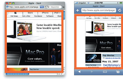


For most of the devices the screen resolution and the display size are equal to the viewport. This thing is applicable in case of desktop , laptops etc, but in the case of mobile it is different. Many pages on web, wont render well on all phones, at their screen resolution. In order to render all the pages well, mobile phone render pages on the virtual resolution and then scale them down to fit on the screen of the device.
For example: In iOS the device screen width is 320 pixels and the viewport size width can be 980 pixels, so in this case, the webpage with 980 px width, will fit perfect on the screen.


Viewport Meta Tags

Safari on iOS displays almost all the pages well, that are designed for desktop. If this doesnt work then you need to change the settings by configuring the viewport. Configuring the Viewport is easy, just add a line of HTML to your webpage. It is basically done through viewport meta tags. Typically viewport meta tag is used to set the width and initial scale of the viewport to improve the presentation of the webpage. For example : if the width of your webpage is less than 980 px, then you should set the width of the viewport to match the width of your webpage.

"Viewport meta tags are basically used to configure the width and the scale of the viewport"

If your webpage is narrower than the default width, then set the width of your viewport to the width of the webpage, as displayed in the image below:


Viewport settings for Web Applications

If you are designing web application specifically for iOS, then the recommended size of your webpage should be the size of the iOS. Apple recommends that set the width as “device-width” so that the scale is 1.0 in the portrait orientation and it doesn't change when the device is in landscape orientation.


Configuring the viewport helps resizing the web content for the device. But it will not be able to give a good user experience every time, because in some cases text will not be readable, user has to zoom in, zoom out , scroll a lot, in order to read the content, reach the targeted link etc.
Email ThisBlogThis!Share to XShare to Facebook
Posted in content design, iOS, mobile experience, sizing the content, viewport | No comments
Newer Post Older Post Home

0 comments:

Post a Comment

Subscribe to: Post Comments (Atom)

Popular Posts

  • Adding Depth to the 8 Golden Rules of Interface Design (Shneiderman's rules for design)
    Ben Shneiderman, the founding director of the Human-Computer Interaction Laboratory, focuses on the studies of information and visualization...
  • Accessibility Testing: Underutilized Today
    Making sure that your website or application is accessible to all types of users (like the vision, hearing, cognitive, literacy, and the phy...
  • What Game Designers Do That Interface Designer Don’t
    At many occasions stakeholders ask designers to design experiences that are simple yet immersive and engaging for commercial Web application...
  • Playful children and creative thinking
    Children are a great source of creativity when it comes to games and entertainment. Children are interesting to be learned and studied. Kids...
  • Is ‘Responsive Design’ Enough? Don’t Forget the ‘Context’
    The number of consumers using smartphones and tablets to access websites, brands are increasing. This had led to reconsidering how to design...
  • Sarit Arora talks about Emerging UX Trends & Practices at 'd+b Talks'
    Few days ago, Sarit Arora from Yahoo! visited our campus to give a talk on 'Emerging Interaction design trends and User Research for Inn...
  • Shortcut Keys
    This has been contributed by Sachin Kumar Sharma, an employee of MindTree. Most of the time, interaction on the internet is with the mouse. ...
  • Dissecting Discipline of Designing Experiences
    Often I come across different viewpoints on Experience Design discipline about what it is and what exactly experience designers do. The exec...
  • Tree based navigation
    Trees are usually used to navigate hierarchical pieces of information (Country > Province > City) or to organise information so that r...
  • Learning about Information Architecture
    One of the most asked questions in discussion groups is about good references/ study material on Information Architecture, Usability etc. He...

Categories

  • Accessibility
  • Accessible Software
  • aesthetic
  • airport
  • assitive technology
  • augmented reality
  • bangalore
  • brainstorming
  • cellphone
  • collaboration
  • Commenting
  • conference
  • content
  • content design
  • context driven design
  • crowdsourcing
  • Customer Experience
  • d+b Talks
  • dawakhana
  • delhi
  • design
  • design for mobile
  • design fridays
  • design mela
  • Design should be Fun
  • design thinking
  • digital experience
  • disable
  • drawing
  • e-reader
  • elements of signage
  • engaging experience
  • Experience Touch
  • Game Design
  • GIDS
  • Graphic Design
  • Graphics
  • guidelines
  • Haptics
  • HTML5
  • Icons
  • ideation
  • India
  • Indian Railways
  • Information Architecture
  • innovation
  • inspiration for design
  • interaction design
  • interaction pattern
  • Introduction
  • iOS
  • ipad
  • ipad 2 usages
  • iterative design
  • laptop
  • Latest Trends
  • leaptop
  • London
  • long term memory
  • LTM
  • megids
  • mela
  • microsoft
  • MindTree
  • mobile
  • mobile context
  • mobile experience
  • online experience
  • opnions
  • Osmosis
  • pattern
  • PC
  • Persona
  • personal computers
  • personas
  • photo storage
  • photos
  • physically challenged
  • Pictogram
  • Pret
  • problem
  • product design
  • QR Codes
  • Rapid Prototyping
  • Reference
  • Reservation Engines
  • Responsive design
  • Salary Survey
  • Search Engine
  • service design
  • session
  • short term memory
  • sign
  • signage
  • sizing the content
  • sketching
  • smartphone
  • Social Networks
  • solution
  • solutioning exercise
  • spastic society of karnataka
  • splash screen design
  • STM
  • street sign
  • tablet
  • tag
  • Tangible User Interface
  • TATE
  • Text input
  • thoughts
  • touchscreens
  • traffic sign
  • translation
  • travel
  • tree based navigation
  • TUI
  • ui patterns
  • url
  • usability
  • Usability Analysis
  • User Experience
  • User Experience Design
  • UX and agile
  • UX design and salsa
  • UX design principles
  • UX planning
  • Video
  • viewport
  • Visually Challenged
  • web experience
  • welcome screen
  • yahoo
  • YouTube

Blog Archive

  • ►  2013 (2)
    • ►  July (1)
    • ►  March (1)
  • ►  2012 (5)
    • ►  November (1)
    • ►  June (1)
    • ►  May (3)
  • ▼  2011 (23)
    • ►  November (1)
    • ►  September (2)
    • ►  August (1)
    • ▼  July (5)
      • Experiences at an Airport
      • Signage: A True Global Language
      • Dissecting Discipline of Designing Experiences
      • How to Design sized web content for Mobile web
      • Content Design guidelines for Mobile web
    • ►  June (3)
    • ►  May (4)
    • ►  April (3)
    • ►  March (2)
    • ►  February (2)
  • ►  2010 (13)
    • ►  November (3)
    • ►  October (3)
    • ►  September (1)
    • ►  August (3)
    • ►  July (1)
    • ►  June (1)
    • ►  May (1)
  • ►  2009 (13)
    • ►  October (1)
    • ►  August (1)
    • ►  June (2)
    • ►  May (1)
    • ►  April (1)
    • ►  March (1)
    • ►  February (1)
    • ►  January (5)
  • ►  2008 (24)
    • ►  December (3)
    • ►  November (5)
    • ►  October (3)
    • ►  September (3)
    • ►  August (2)
    • ►  July (5)
    • ►  June (3)
  • ►  2007 (1)
    • ►  May (1)
  • ►  2003 (1)
    • ►  May (1)
  • ►  2002 (1)
    • ►  September (1)
Powered by Blogger.

About Me

Unknown
View my complete profile